↓ Bounce Rate
Measurable reduction — figures on request
Work Experience Highlights
Between 2024–25, I worked with the ECE Department, managing up to 60 production requests per month. My role quickly expanded to include end-to-end product design across ECE’s web properties. This page covers my work on ECE.UTORONTO.CA, from the Homepage and Events to Industry Opportunities and Research at ECE.
ECE's website didn't give prospective students a clear reason to explore its programs, and it wasn't working for faculty outreach or marketing. The goal wasn't to reinvent the site.
It was to find where content discovery, student engagement, and partnership conversations could improve, while staying faithful to the department's brand.
Read More belowI conceived, designed, and rebuilt core parts of their public-facing website—reimagining the digital student experience, delivered as a responsive website across phone, tablet, and desktop.
I needed to know who the site should work for first. I interviewed stakeholders, reviewed competitor department sites across North America, and talked informally with students and faculty.
Every audience mattered, but a page that works for someone with no context works better for everyone else too. That meant designing for two people.
The first is the 17-year-old choosing a major, who wants to know whether the place is serious enough and whether there was a student life otuside of academia. The second is the older graduate applicant, who needs to know about the institution, its research and industry collaborations, etc, to justify years of commitment.
It also gave the team a objective for the whole project: does this section or copy serve prospective students?
THE HOME PAGE - ECE.UTORONTO.CA/
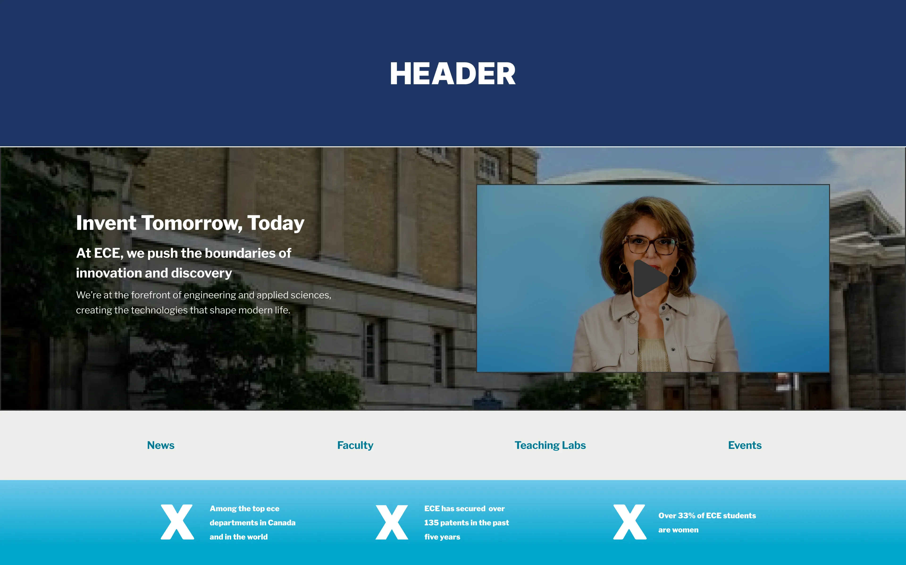
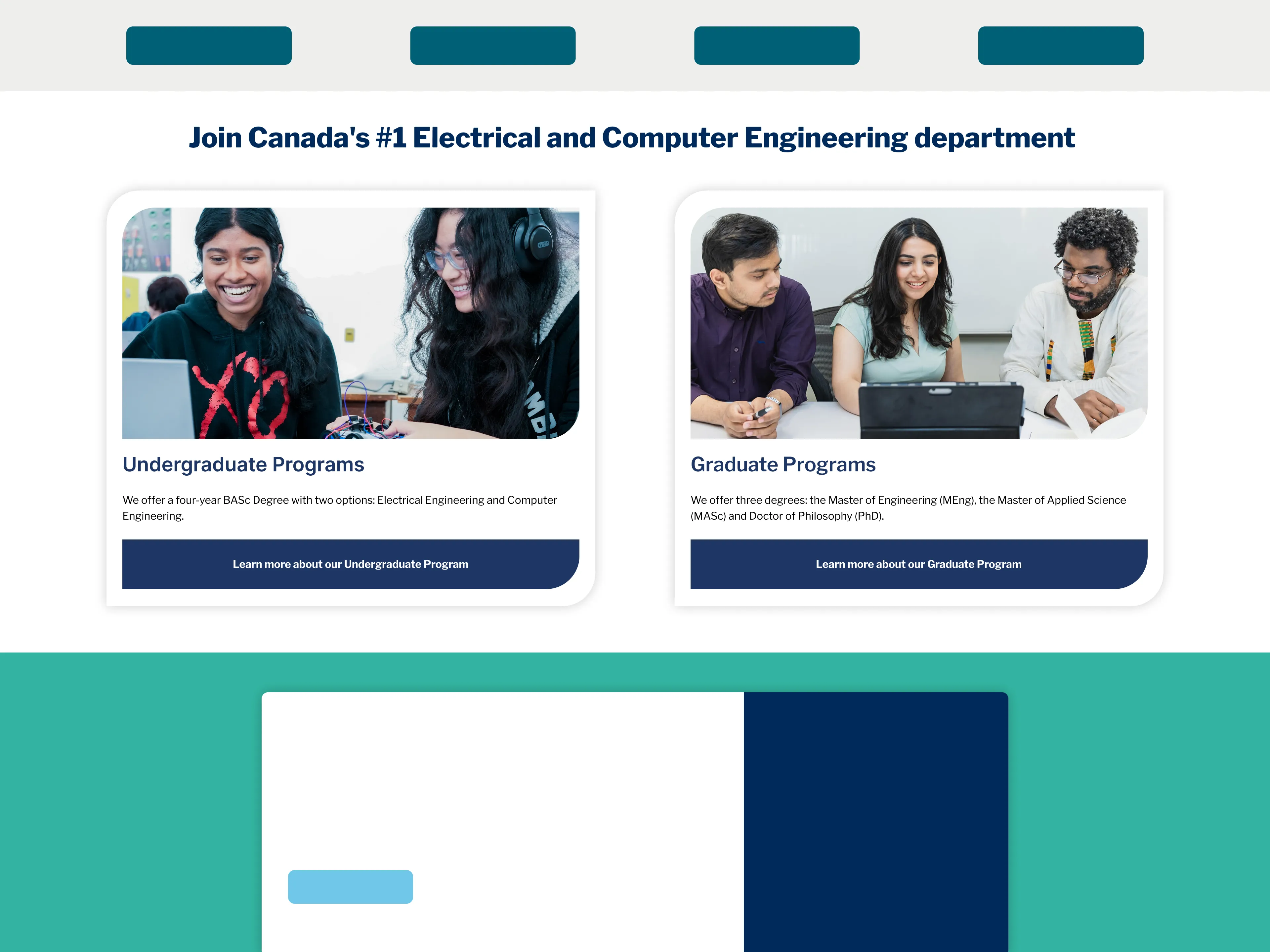
I restructured the Homepage from the ground up into independent modular sections, each optimized for a first-time visitor. The goal was a page that pointed clearly inward, to internal pages that were actually of value to the visitors.
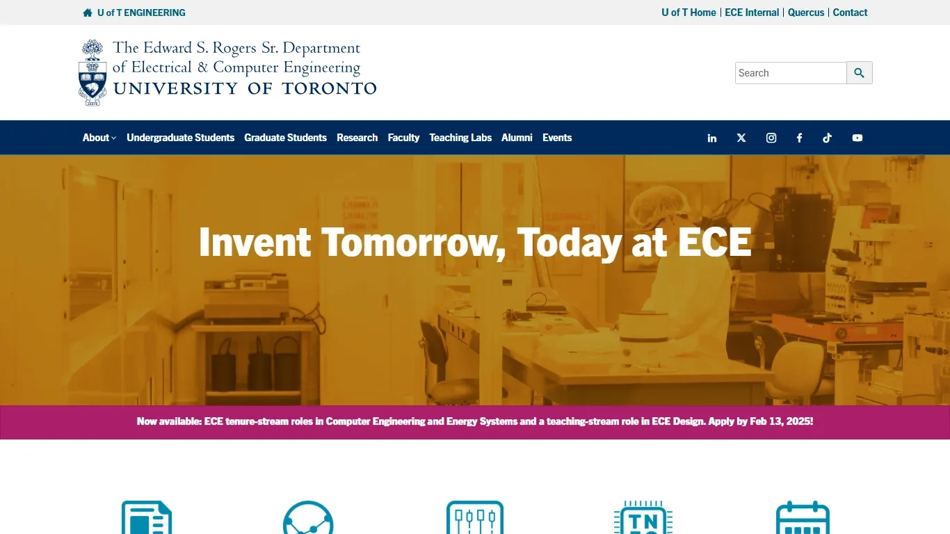
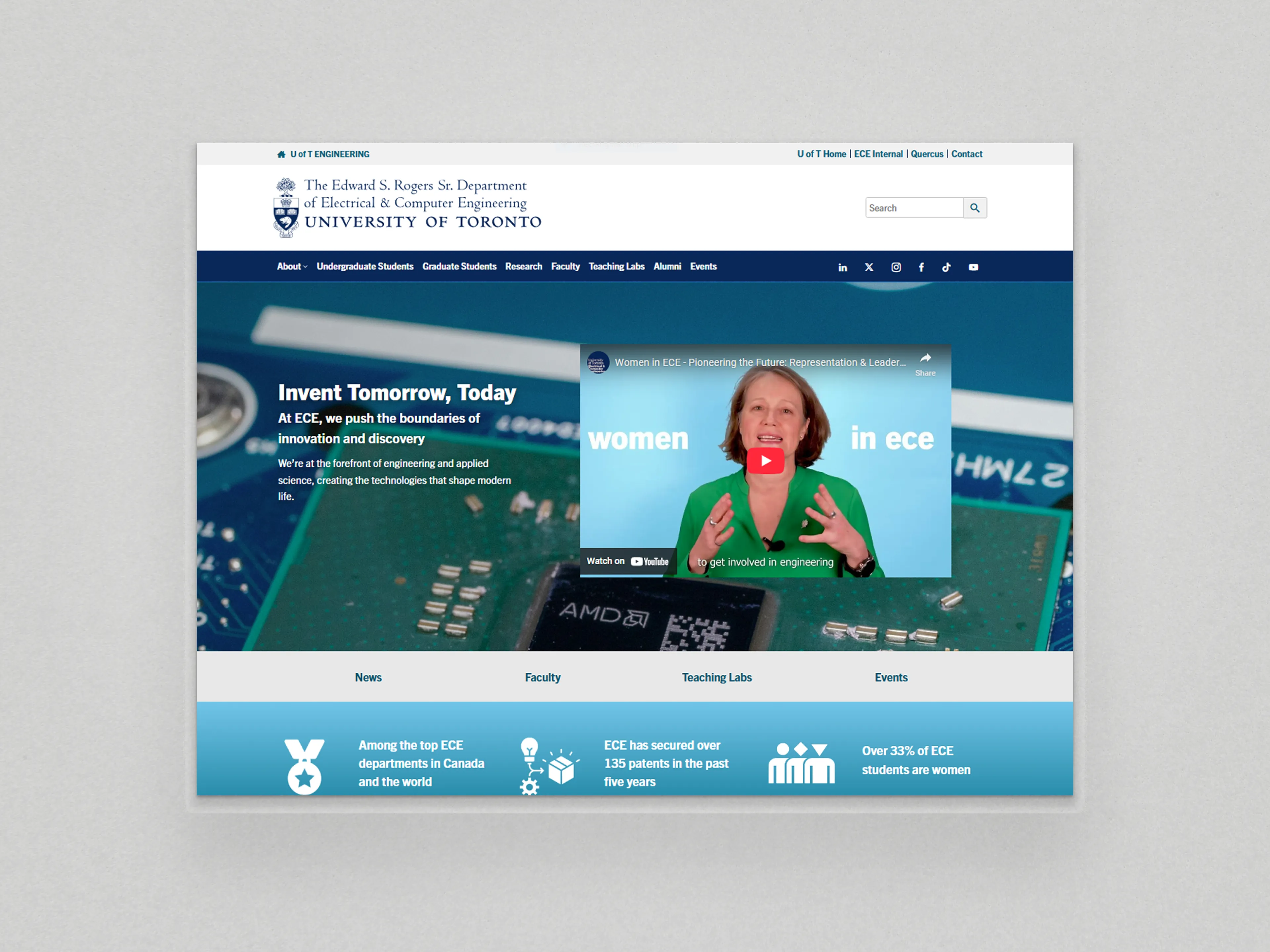
My design focused on making it be perceived as open, active, and easy to engage with, instead of users having to hunt through dense sections, that were also disconnected visually from the rest of the site.
![ECE's Homepage Hero Section [Before]](/assets/ece/ece-old-hero.webp)
![What ECE's Homepage Programs Section [Before]](/assets/ece/ece-old-programs.webp)
/INDUSTRY-OPPORTUNITIES &
/RESEARCH/STUDENT-RESEARCH-OPPORTUNITIES
Industry Opportunities is an original page for industry partners, with "Work with us" and "Sponsor us" calls to action and departmental metrics. The department was active in industry but the site didn't show it. A prospective student reading the page sees that the department is working to connect it to organizations.
Student Research Opportunities is another original page that falls under the Research at ECE page, which had no way to host student job postings. Research access is a deciding factor for graduate applicants, so the page tells them the opportunities exist.
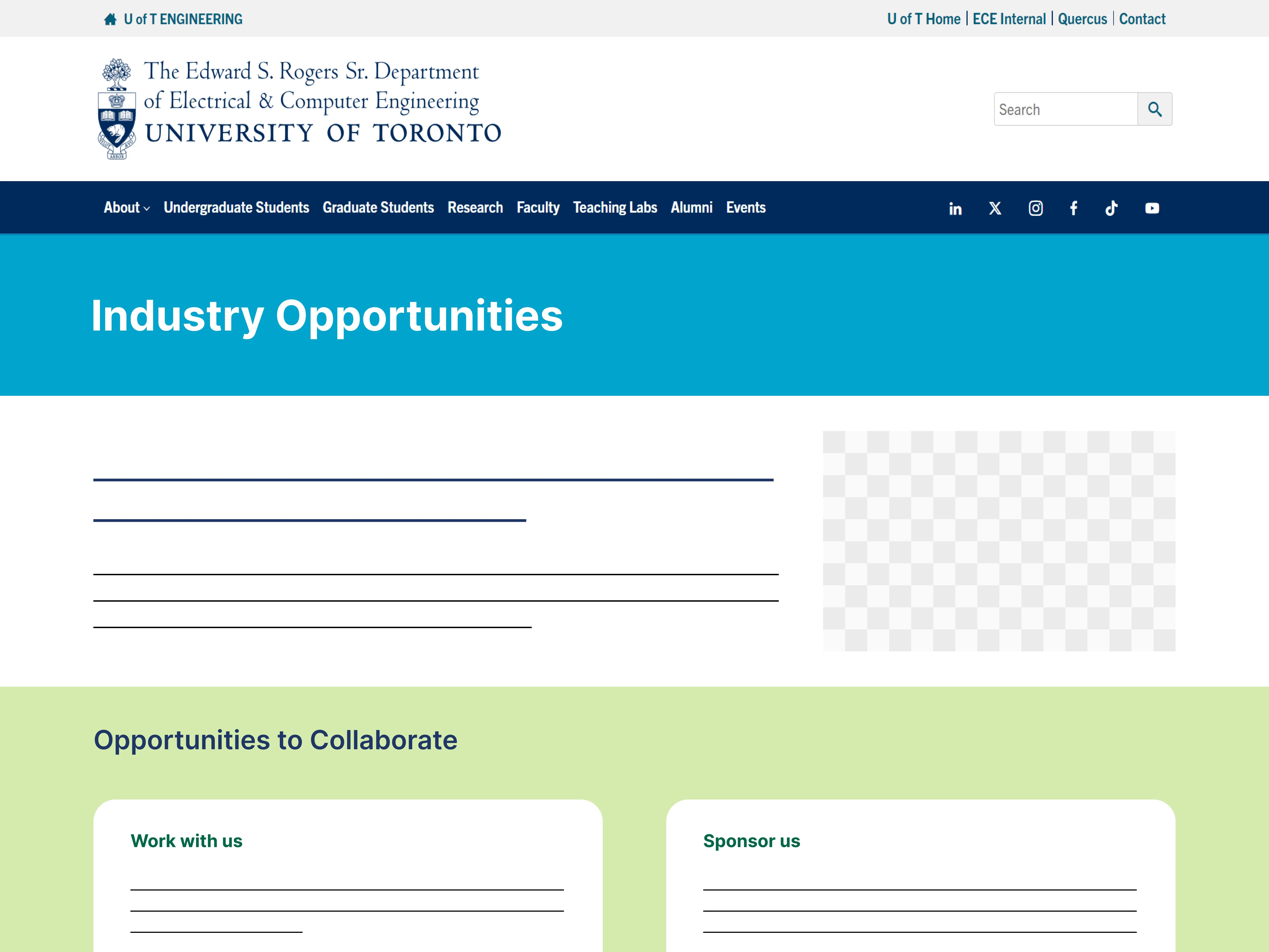
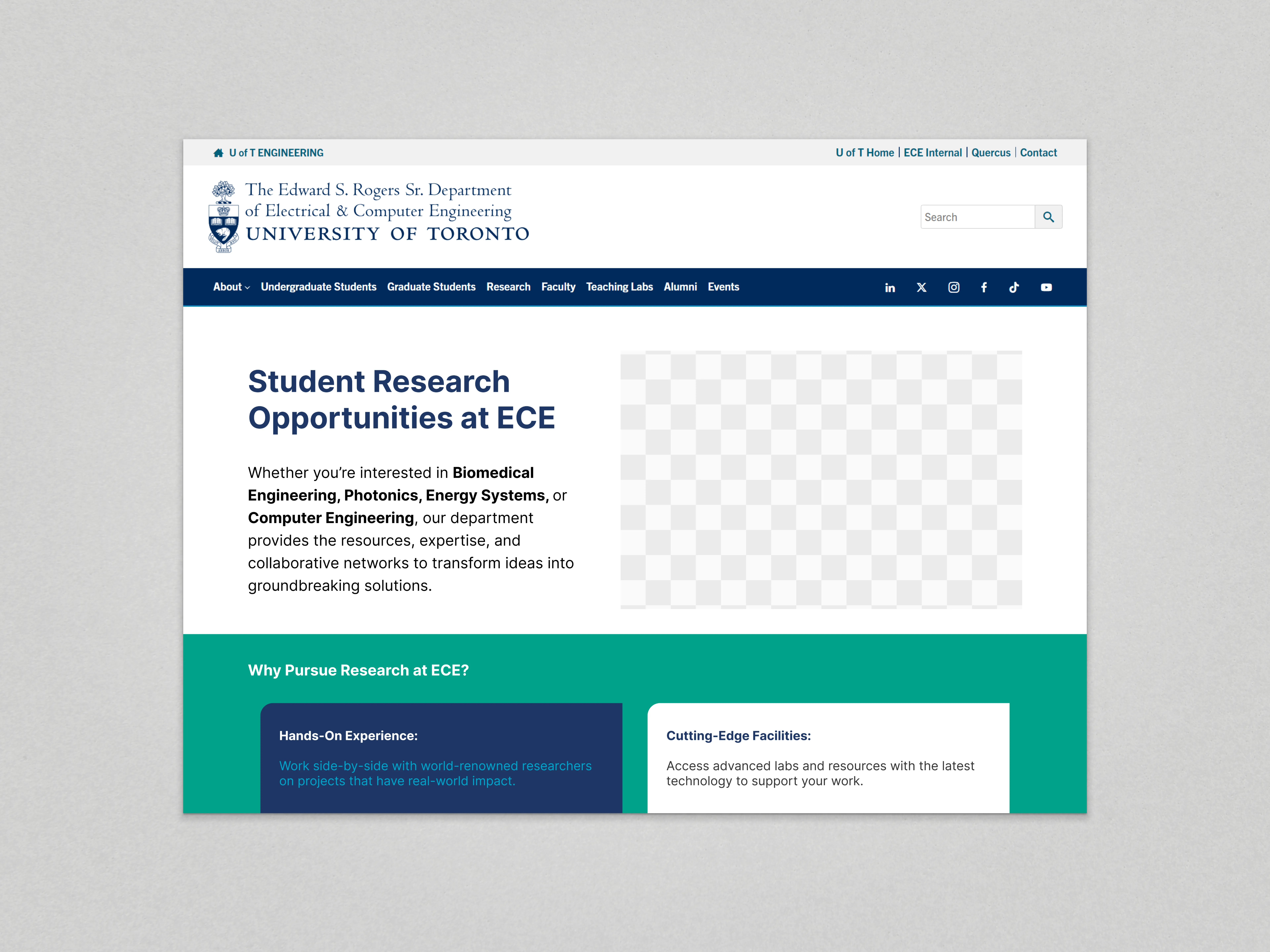
Several teams maintained the site, and there was no shared component library, so pages kept rebuilding the same patterns from scratch. I built the pages above with components that non-designers can duplicate with copy edits, and made each one responsive so it holds up across phone, tablet, laptop, and desktop.
This scalability was useful in my next big project for the ECE, where I had to integrate a standalone departmental web property (TNFC lab) inside ECE's website.
Components built for both the TNFC and the pages built as part of this project were then reused for the the integration of another departmental web property (Grid Modernization Centre) after I left.
THE EVENTS PAGE - /EVENTS
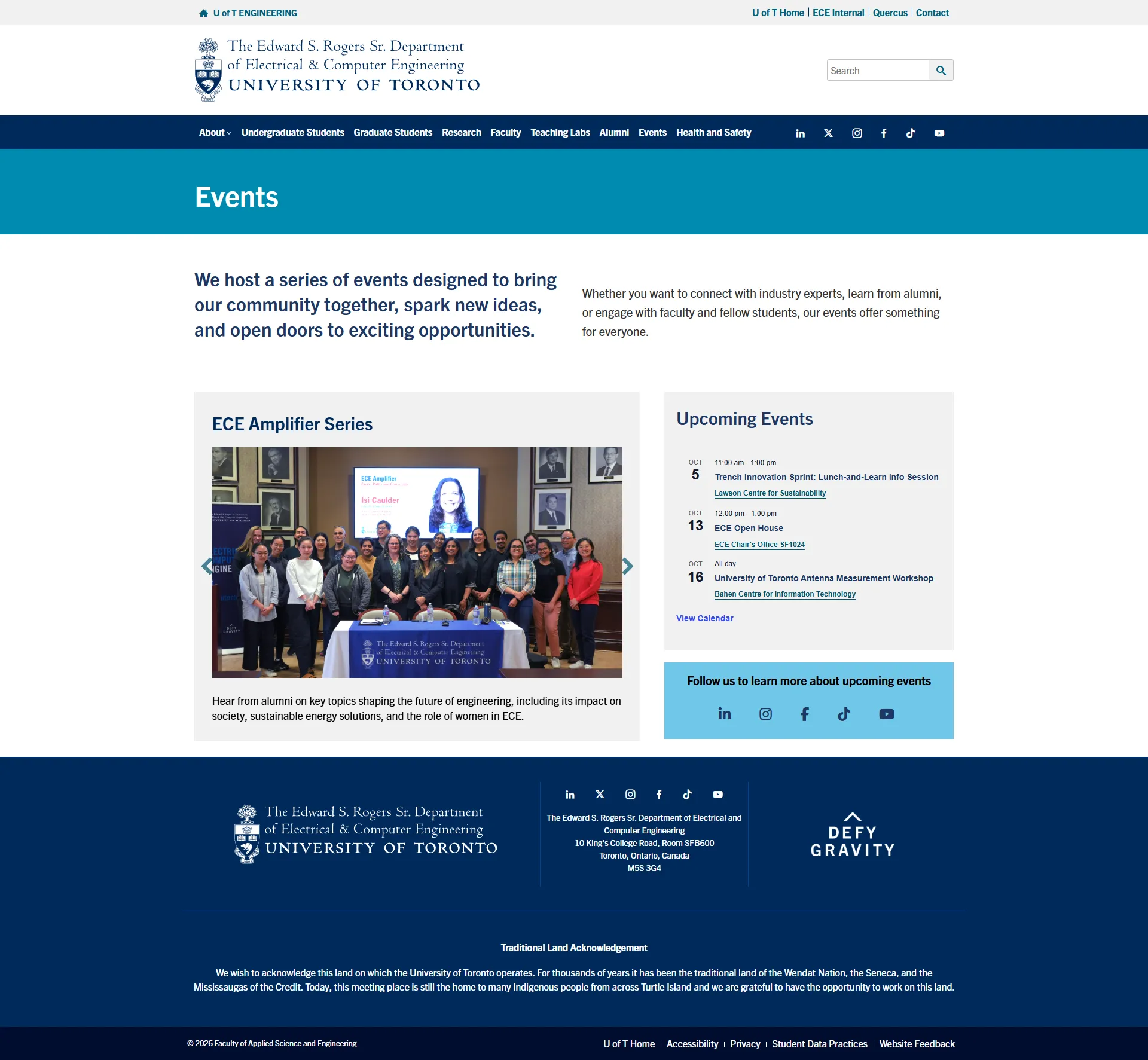
Previously the Events page on the website was simply the Events Calendar page that the Events plugin auto-generated. This calendar had the slug /events. But there was more to Events than a Calendar.
I turned it into a structured page with category cards in a slider, contextual information, and the full calendar accessed through an embedded widget on the sidebar. Visitors see the range of events first, then go into detail if they want to.
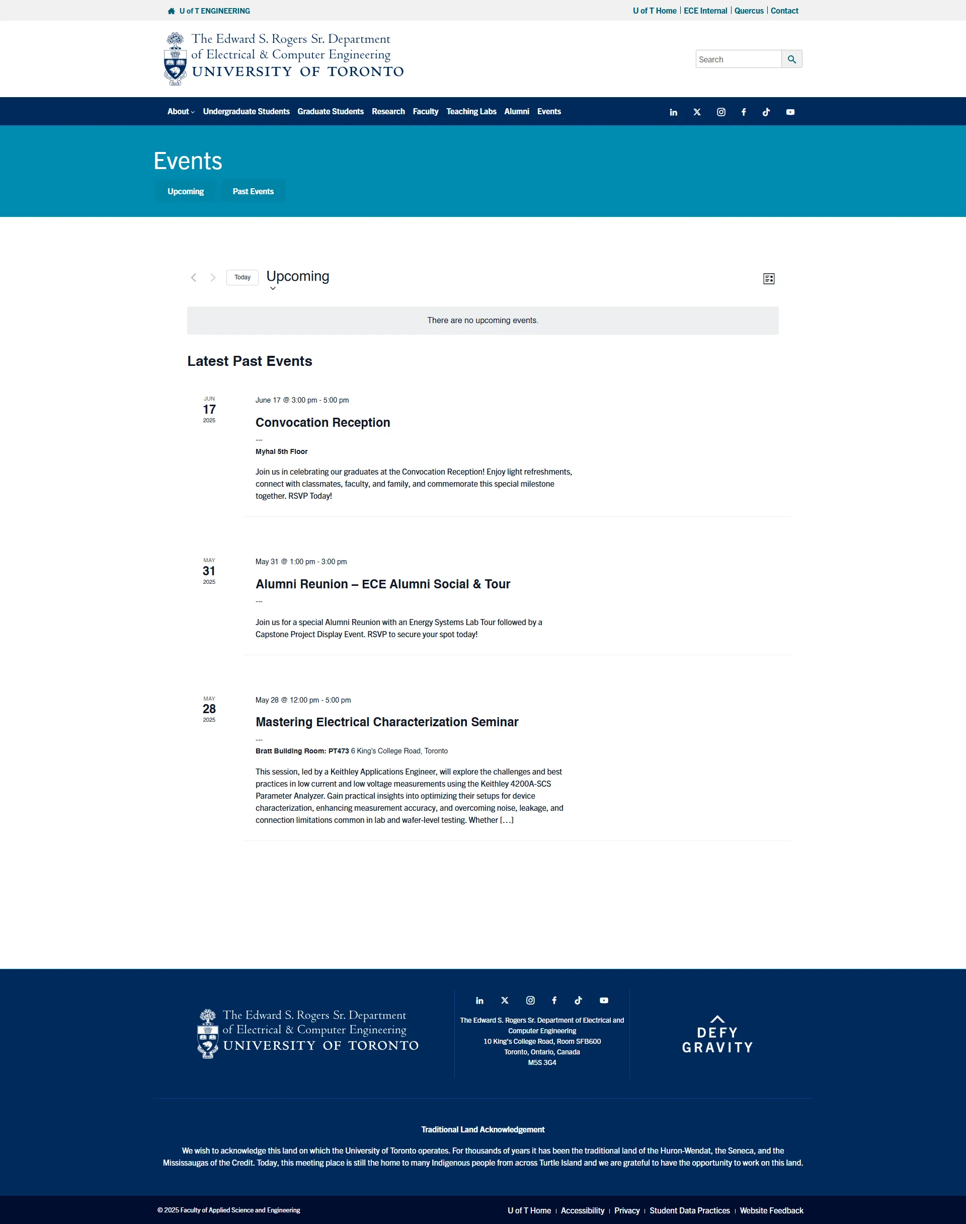
Whether accessed from a phone between classes or a desktop for research, the experience has to remain consistent across devices. Responsive layouts, flexible components, and adaptive content ensure the same intuitive navigation and visual hierarchy across phone, tablet, laptop, and desktop.
This approach transforms a website into an ongoing information guide —faster, clearer, and more valuable for both people and the educational institution— while respecting the trust users place in their university during some of the most important moments of their lives.
In the same role, I led a project to integrate standalone web properties into the primary digital ecosystem; in particular, the Toronto Nanofabrication Centre [TNFC]. The success of this project led to the integration of another web property: the Grid Modernization Centre (GMC)
TORONTO NANOFABRICATION CENTRE (TNFC)
As a direct consequence of my work, TNFC became a part of ECE's public-facing website rather than operating as a separate, and outdated web property.
TNFC looks and feels like ECE, not a separate organization.
The pattern can be reused for future facilities that need a subsite.
Users can find TNFC without leaving ECE's primary website.