Before
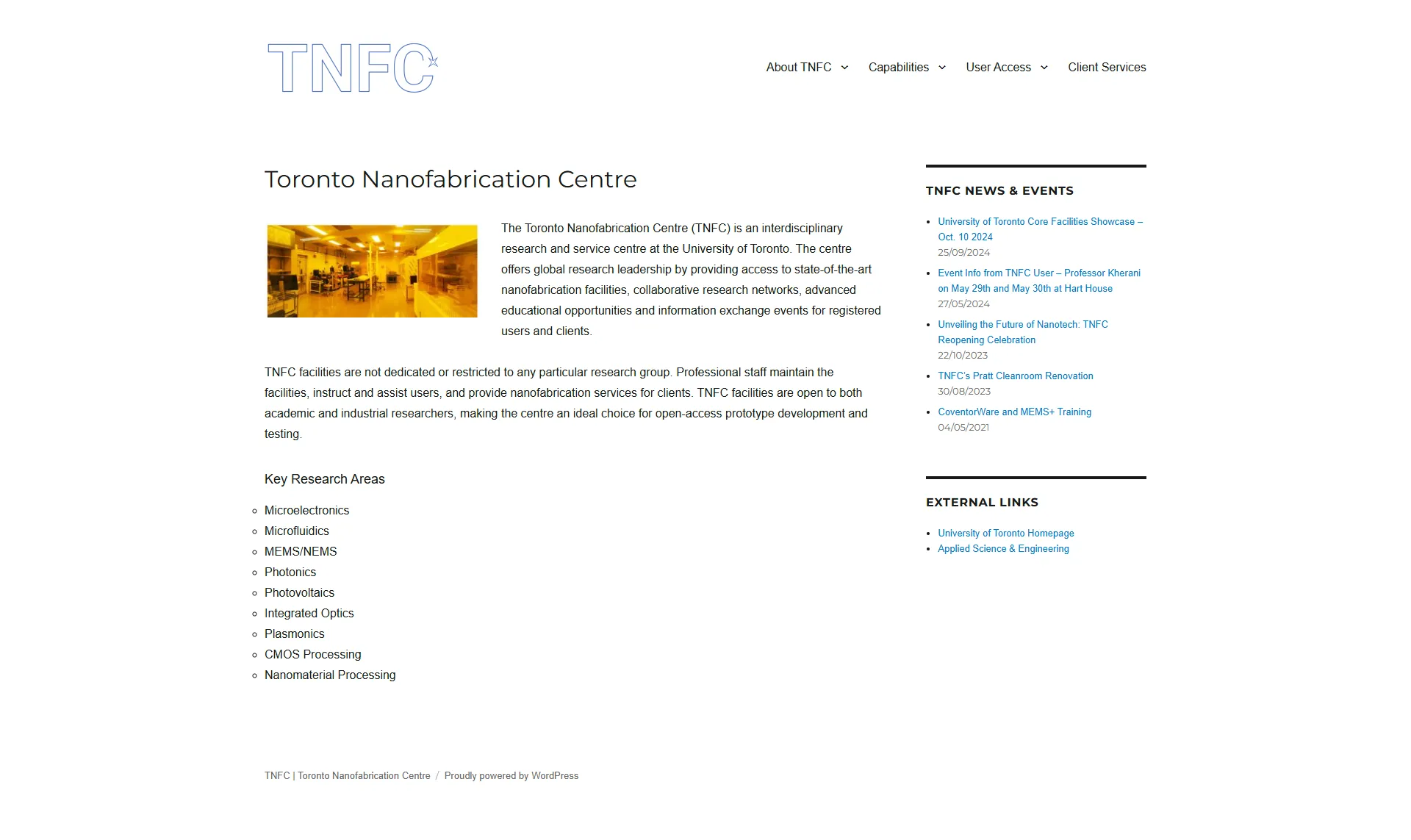
Standalone TNFC website
Isolated departmental silo running on an unmaintained legacy portal, detached from school branding and navigation structures.
Disconnected from ECE
Integrating the discovery and onboarding experience of TNFC into its parent department's digital ecosystem.
I researched, designed, prototyped, rebuilt, and shipped ECE at U of T's Nanofabrication research lab website, converting it from a standalone website with inconsistent branding, to a responsive content hub integrated into ECE's public-facing website, working across phone, tablet, and desktop.
TNFC had its own website and no connection to ECE's brand, navigation, or broader digital ecosystem.
The challenge was not to visually overhaul the lab. It was to make TNFC work as part of the system ECE already had, while making it easier for people to discover and access the facility.
Standalone TNFC website
Isolated departmental silo running on an unmaintained legacy portal, detached from school branding and navigation structures.
Disconnected from ECE
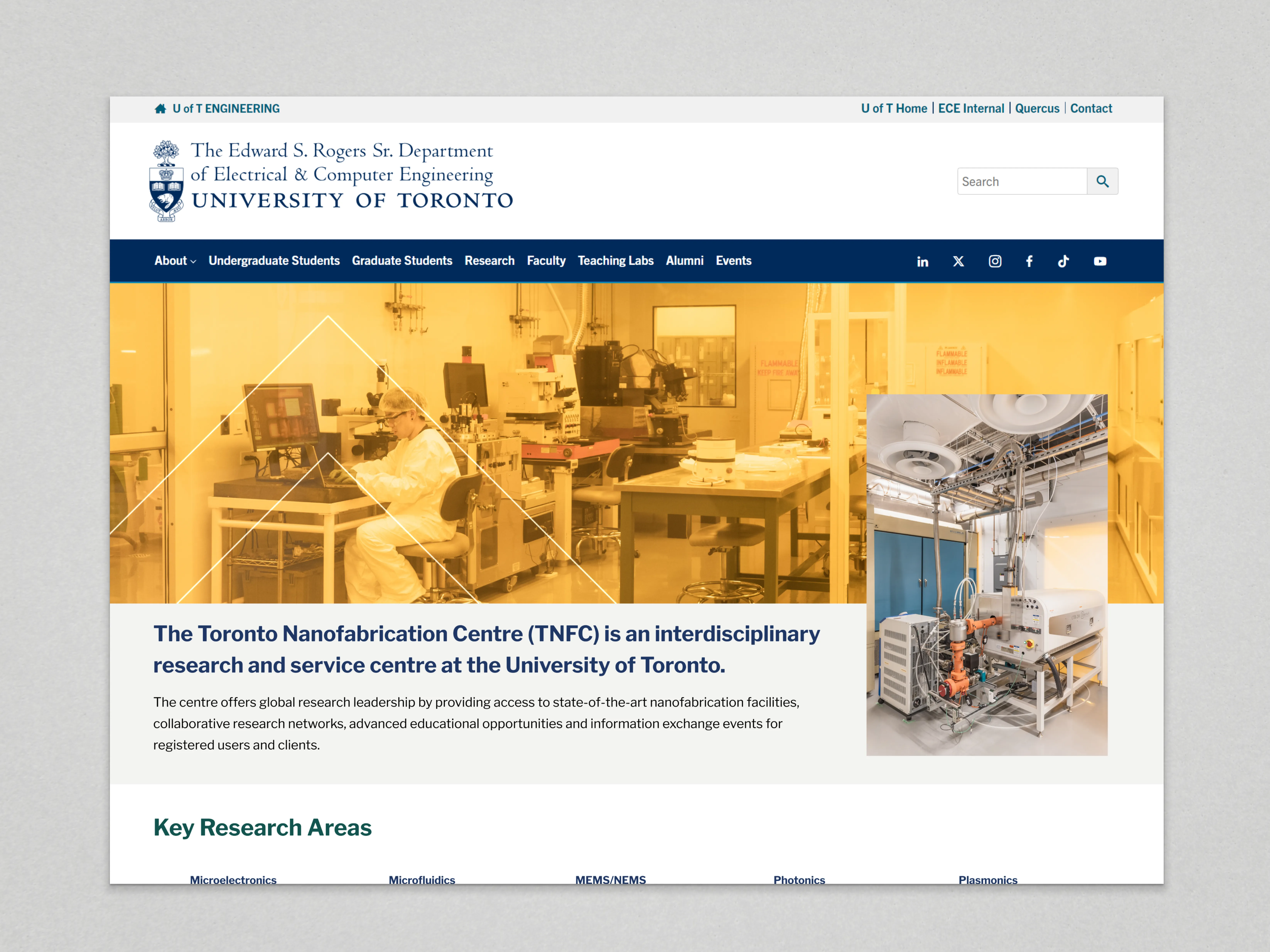
TNFC within ECE
Unified content ecosystem integrated into ECE department discovery, providing streamlined navigation and responsive design.
Integrated into ECE
Standalone CMS
ECE ecosystem
Separate branding
Integrated navigation
Disconnected navigation
Responsive experience
The existing site had a large number of top-level pages, but many were essentially link aggregators leading to information buried in sub-pages.
I stripped the existing structure back to find what the users needed. This revealed two core user flows: people who wanted to know what TNFC was and what it offered, and people who wanted the information required to use the facility.
Important TNFC content was often difficult to discover because of where it sat within the existing navigation.
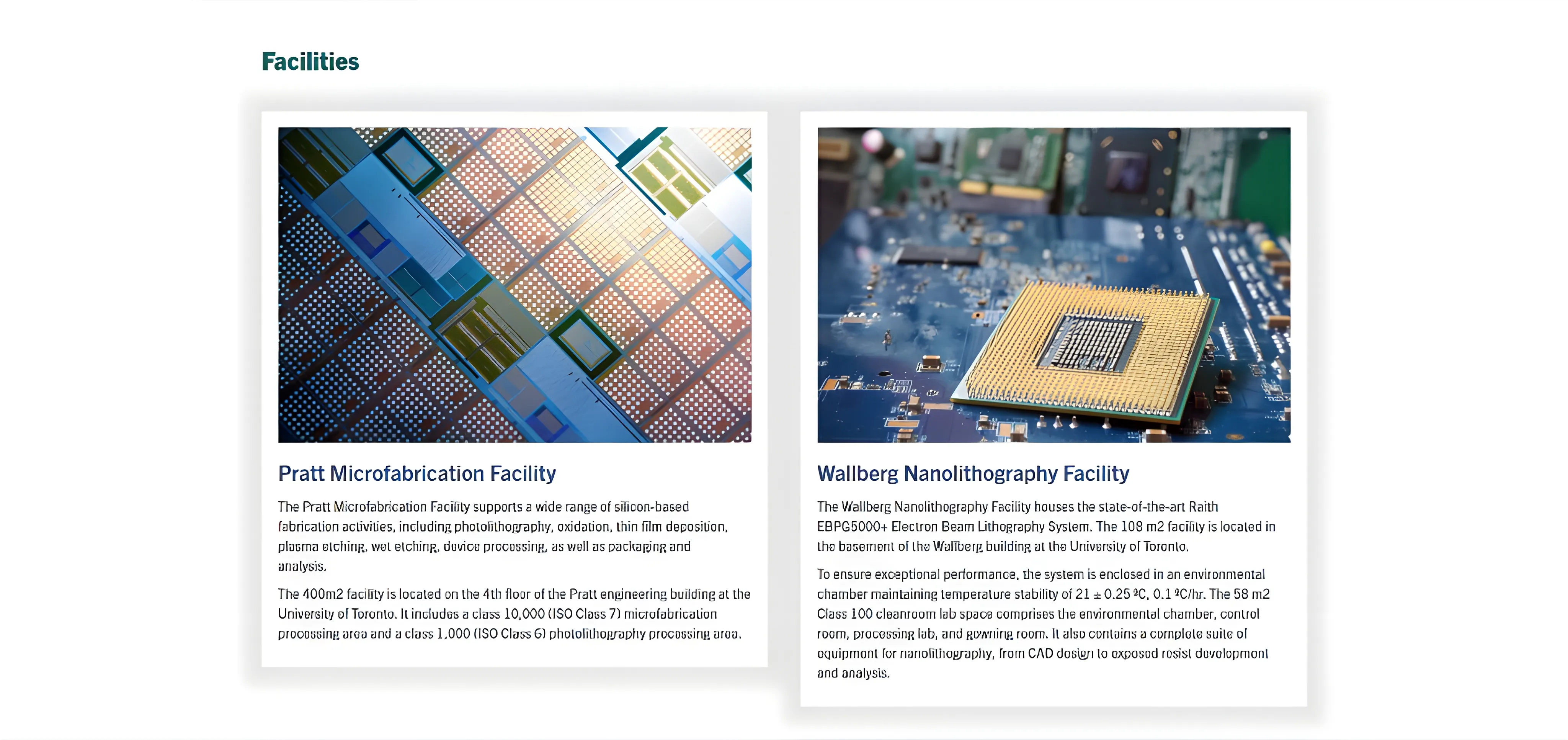
The two lab facilities, for example, were buried under About Us. I brought them into the homepage as a structured card grid so users could understand what facilities were available without navigating deeper into the site.
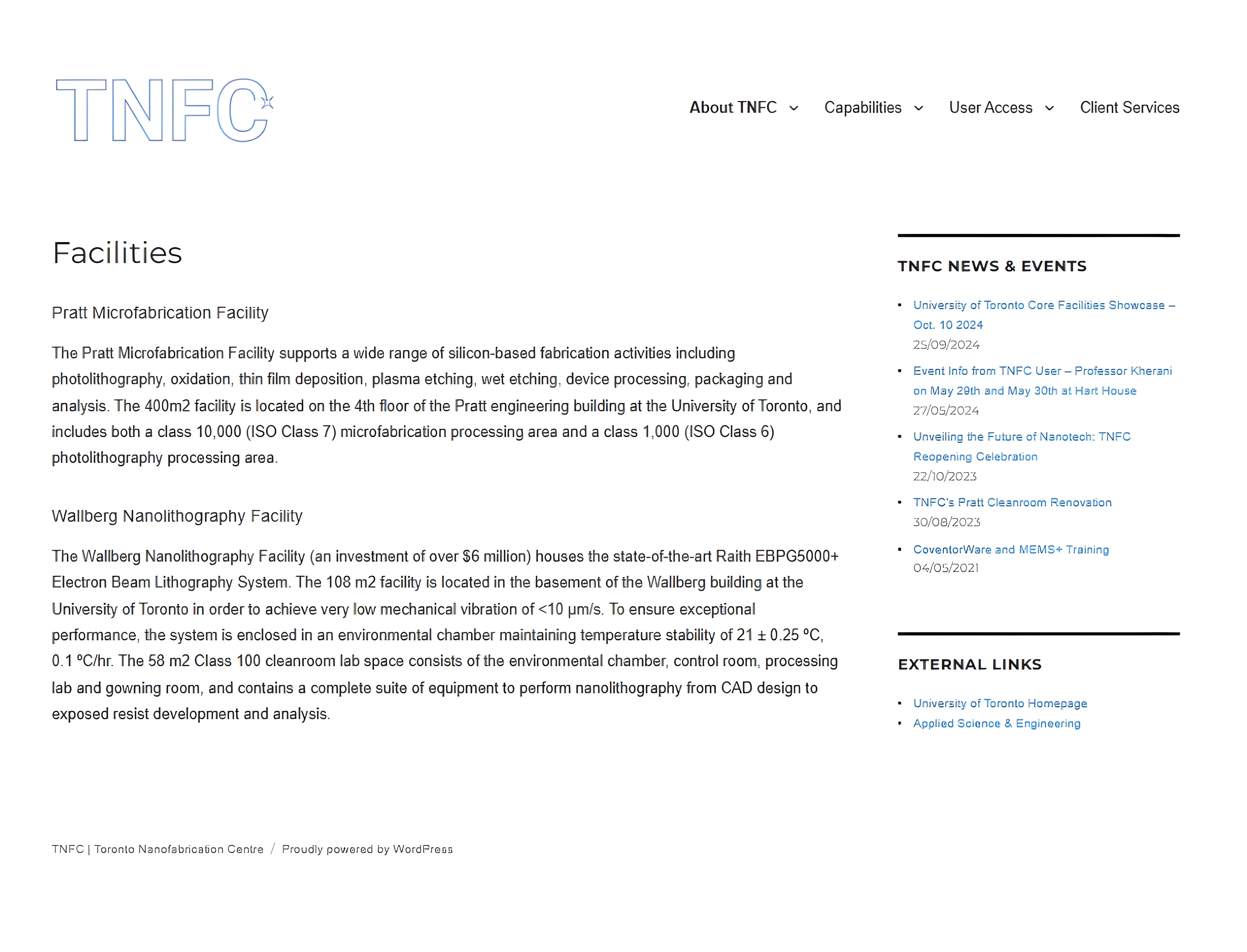
User Access was one of the most important parts of the site, but its information was distributed across five sub-pages covering forms, training, fees, policies, and compliance requirements.
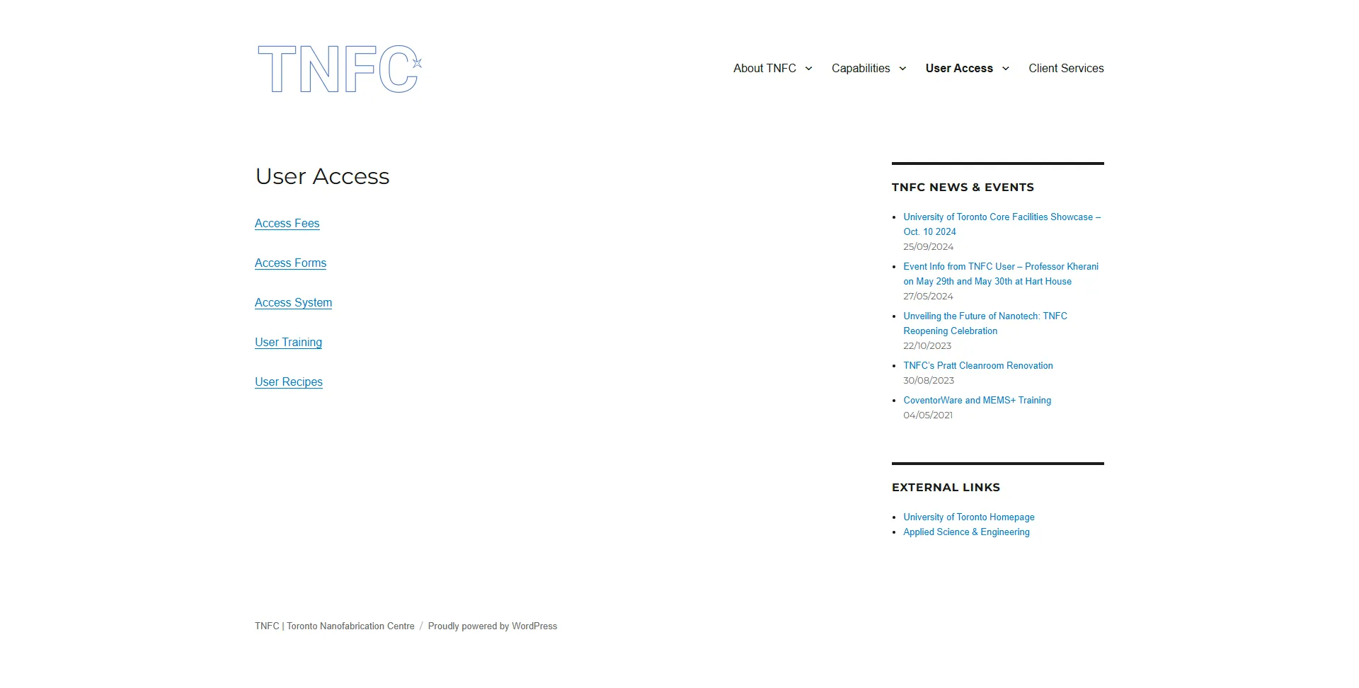
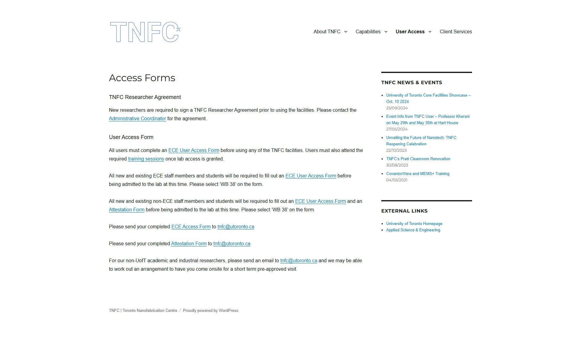
I consolidated these into a single User Access page, reducing the number of steps required to find the information needed for onboarding.
Where content was better suited to another format, I kept it out of the interface. For example, the long Access Fees tables were proposed as a downloadable PDF linked from the User Access page rather than reproduced as another long page.
Some information was technically available on the original site but was easy to overlook because of how it was presented.
TNFC's partner organizations were listed as text links on a separate Partners page. I brought them into the homepage as a three-column section with an auto-scrolling logo gallery, giving the information a stronger visual presence and making the partnerships easier to recognize.
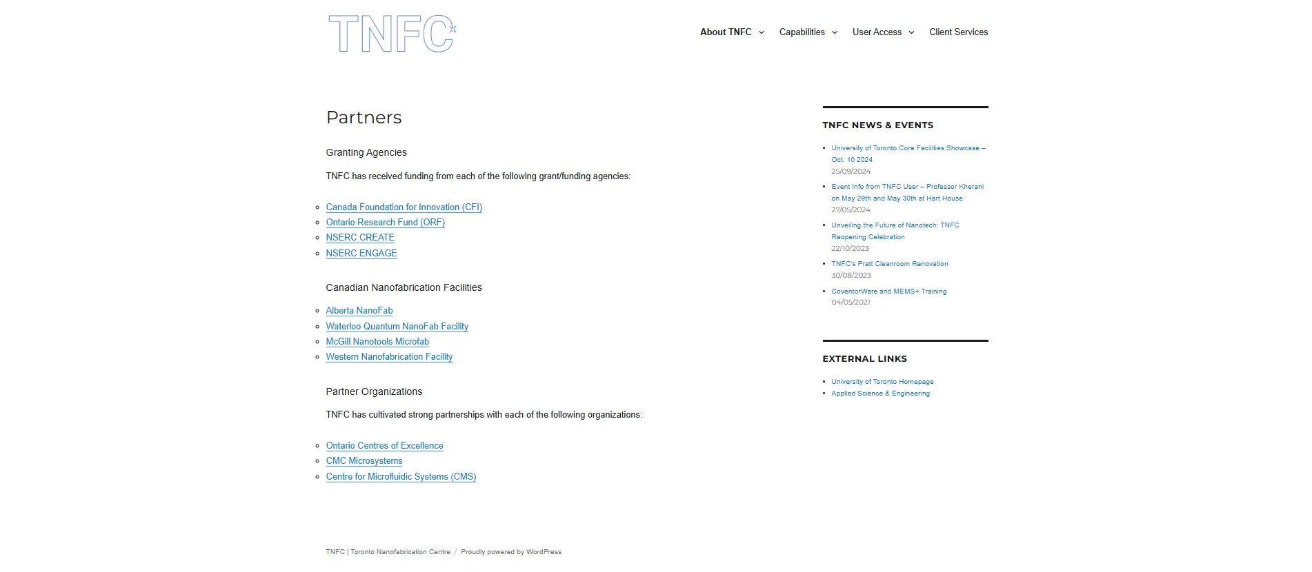

The same principle informed how other content was presented: important information needed to be visually discoverable, not simply available somewhere in the site.
ECE did not have a shared component library at the time, so similar interface patterns were often rebuilt across individual pages.
I designed the TNFC components as modular, repeatable patterns. For eg, Facilities and services could be added by extending an existing component rather than creating a new pattern each time—allowing work to extend beyond TNFC.
After I left, components and patterns from the TNFC pages (including most sections on the TNFC home page) were reused for other ECE content, such as the Grid Modernization Centre—a page integrated like TNFC was.
No one interacts with a website from a single device. TNFC was designed responsively from the first frame, delivering a consistent experience across mobile, tablet, laptop, and desktop.
Every layout, component, and content section was built to adapt fluidly across screen sizes, ensuring navigation remained intuitive and information remained readable regardless of how students accessed the site.
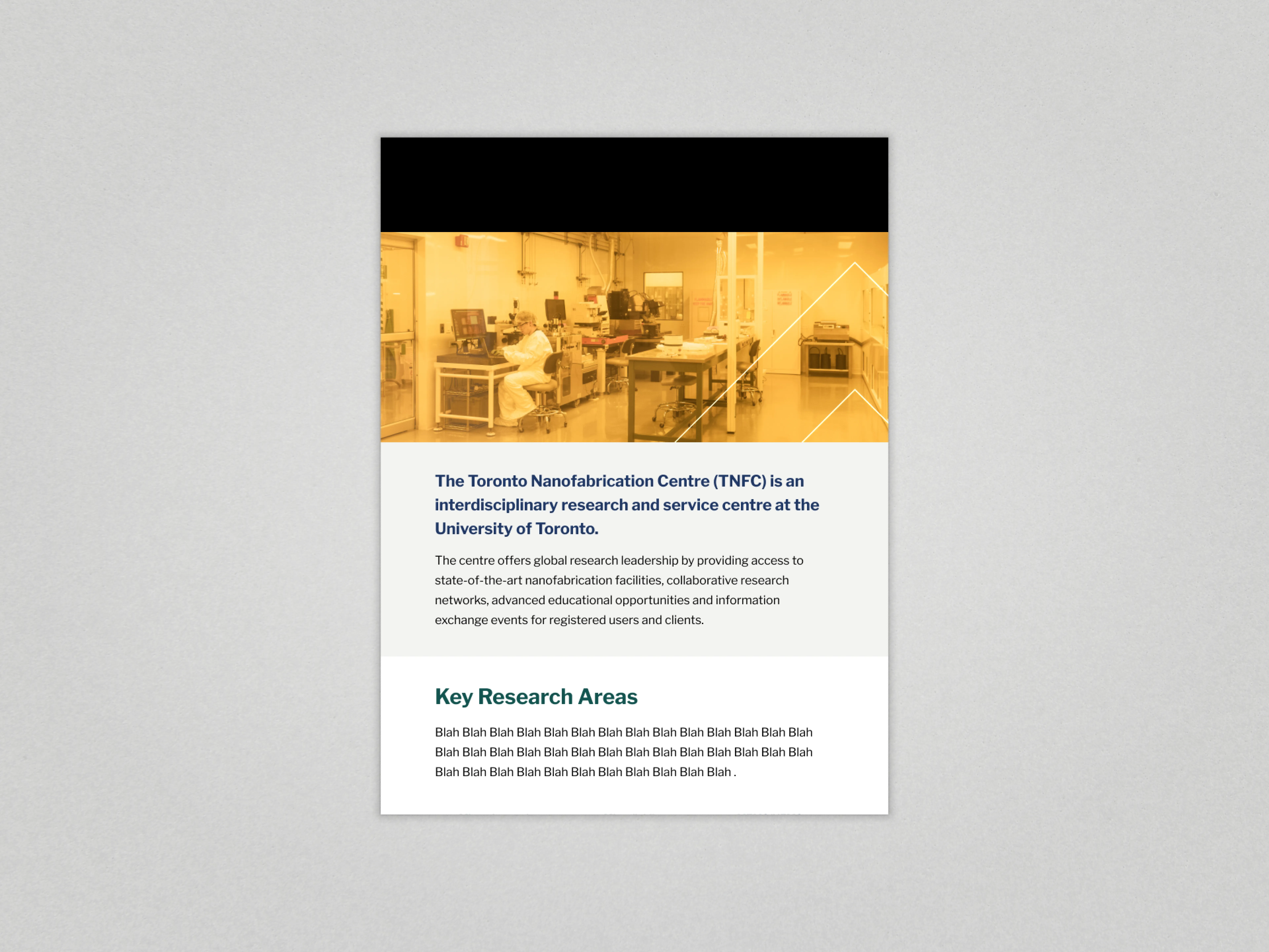
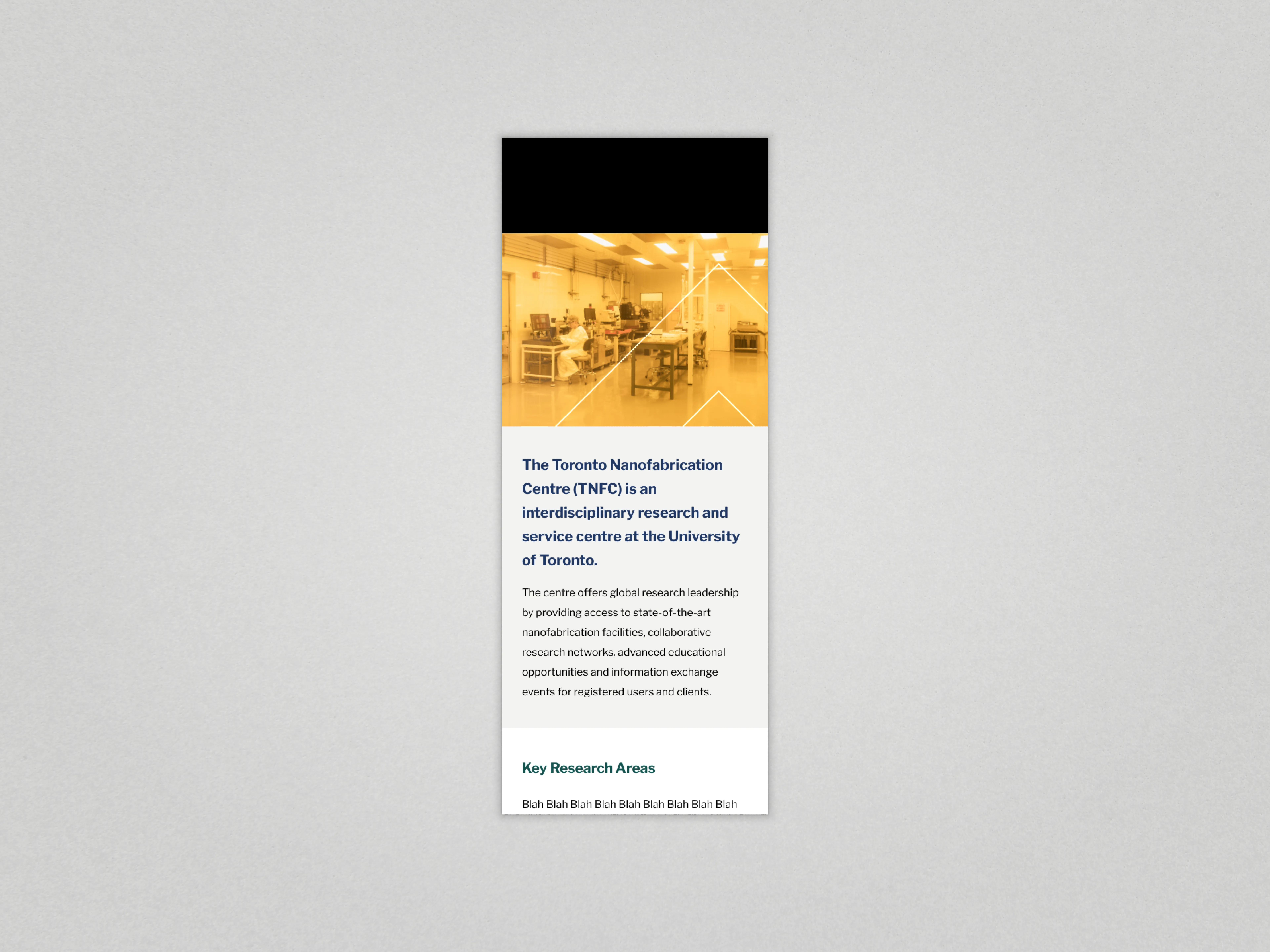
TNFC became part of ECE's public-facing website rather than operating as a separate digital property.
Every design decision was driven by the need to ensure ease of access to the regulations, including access, training, billing, and safety. At the same time, the pages were designed to feel native to ECE while also expressing TNFC’s identity and values. The result positions TNFC as a core, high-value research facility within the department.
The prototyping for the TNFC homepage and its intial sub-page was done in under two weeks—because I wanted working drafts in front of stakeholders early.
Why? There were a couple of design decisions that non-design stakeholders couldn't envision at first. My working drafts and prototype were instrumental in ensuring they weren't approving something they misunderstood or required major rework late in the process.
The approvals process took much longer than anticipated which caused the project to be in the final phases of web development during the final week of my contract—causing a rushed production of assets and finalization/visual polish. Other delays were mostly scheduling related and not design/development related.
After I left, development on other parts of the site reused components and patterns that were originally designed for TNFC's section, including the Grid Modernization Centre's new page. The patterns were picked up and used after I left—not only were my components and patterns liked—the structural decisions made sense and they were also repeatable.