Designing the ECE homepage around prospective student discovery
I researched how prospective students and other first-time visitors might understand ECE, then translated those findings into the homepage's content, copy, information hierarchy, and interface. The sections below show the individual design decisions that shaped the final experience.
Explore Case StudyHero Section
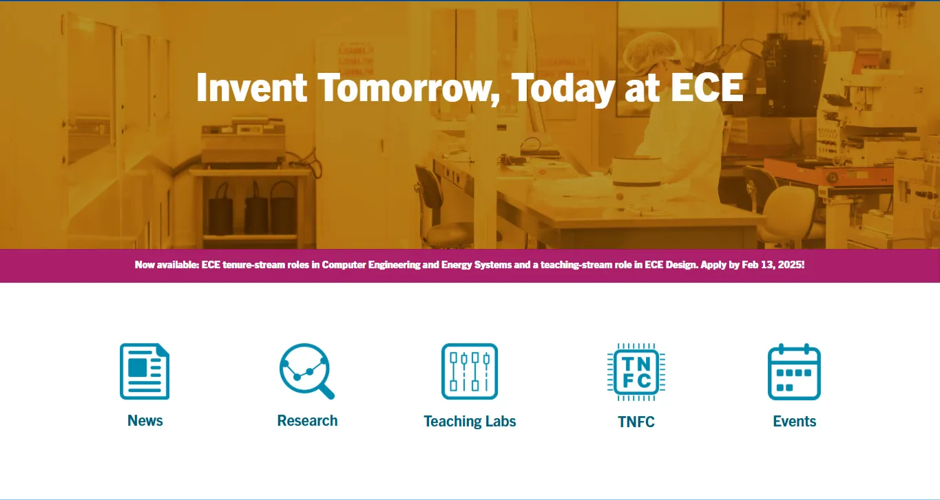
The existing homepage opened with a static image and the slogan “Invent Tomorrow, Today at ECE,” followed by five large icon links to News, Research, Teaching Labs, TNFC, and Events. I redesigned the hero as a two-column banner pairing campaign messaging—a headline, short description, and CTA—with a video.
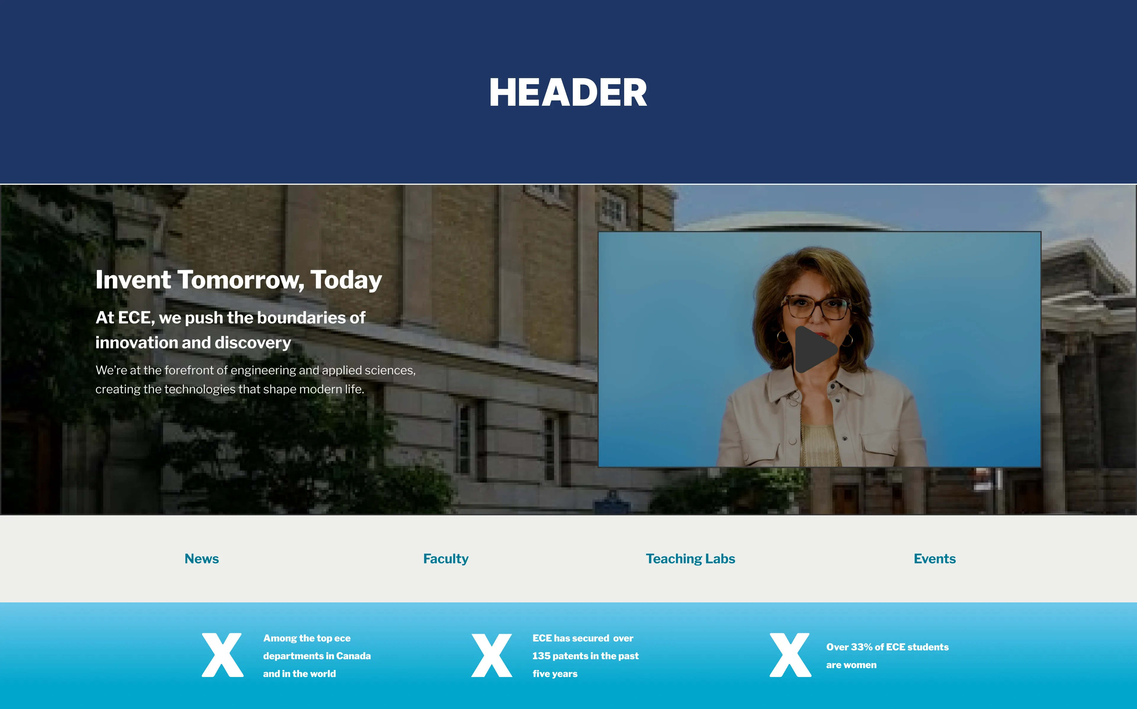
The new structure gave Marketing a flexible surface that could be adapted to different campaigns, whether the focus was student life, research, or an industry partnership, without requiring the overall hero layout to be redesigned.
I also reworked the navigation beneath it. Rather than treating the links as a fixed set of icon destinations, I designed them as reusable link components that could accommodate the department's evolving content. In the final implementation, I built the version with icons and text labels for four destinations, including the News & Insights page and the TNFC content hub (pages I built).
I also explored using the hero to surface three key department metrics, which were ultimately moved into the Programs section.
Programs Section
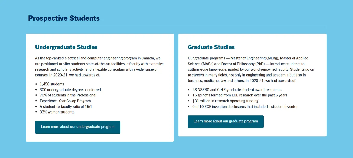
The original Programs section was structured as two cards for Undergraduate and Graduate Studies, but each contained lengthy descriptions and bulleted statistics. While the information was comprehensive, it made the section harder to scan and delayed the path to the actual program pages.
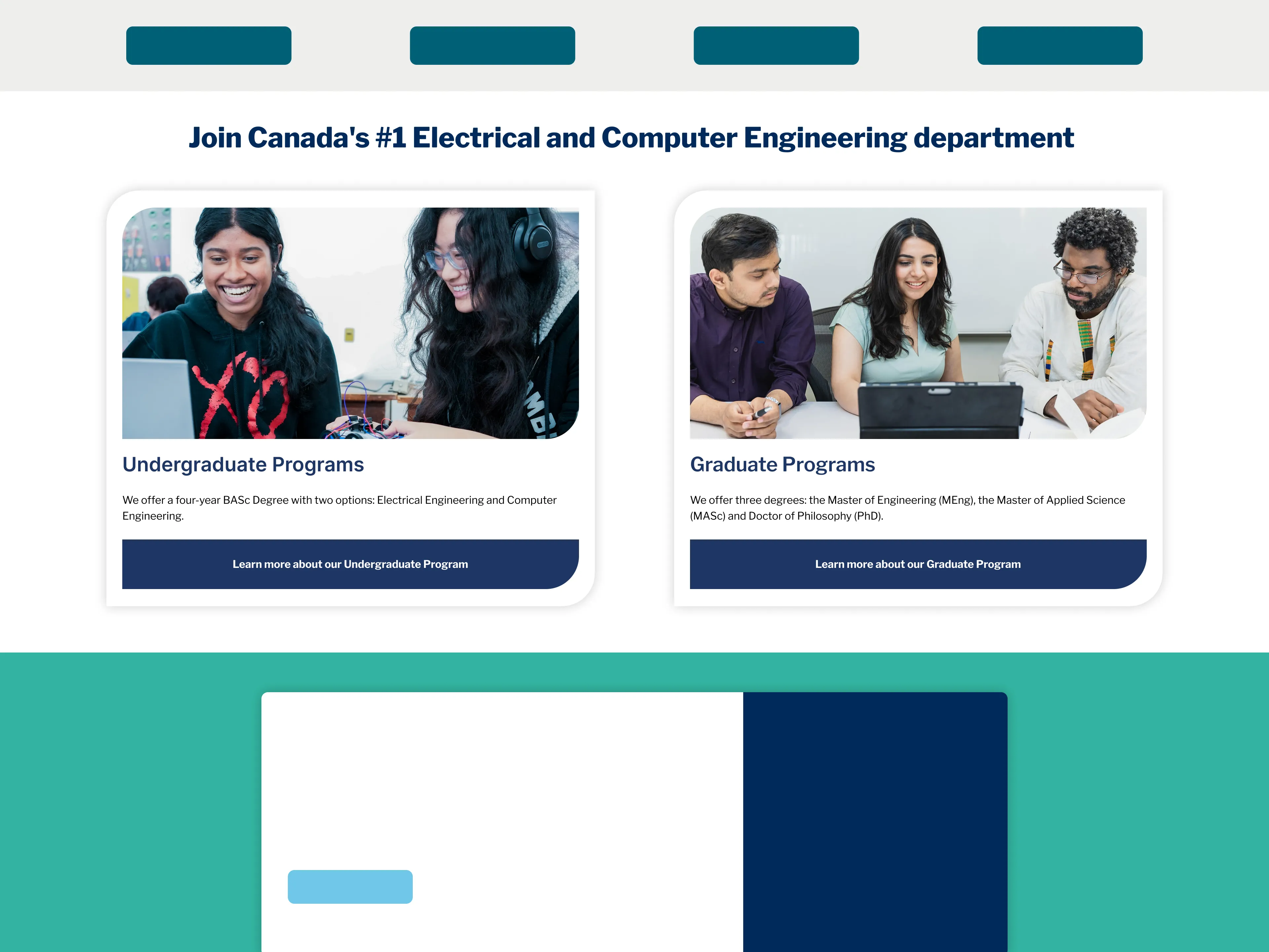
I reworked the section around the information prospective students needed to recognize quickly: what they could study, which degree paths were available, and where to learn more.
I introduced stronger visual hierarchy through program imagery, concise descriptions, and prominent calls to action, removing lengthy supporting copy that could be explored on the dedicated program pages instead.
The result was a section designed to funnel prospective students toward the information they were actually looking for, rather than attempting to contain the full program experience on the homepage.
Pairing institutional context with Events information
The original section was a simple welcome from the Chair, with her photograph, introductory message, and a “Learn More” link. I expanded it into a two-column section that preserved the Chair's introduction while using the adjacent space for upcoming events.
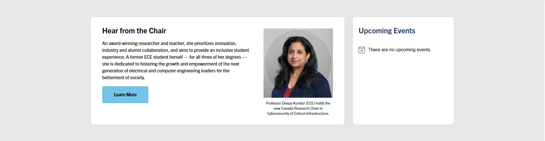
The layout separates the two purposes without making either compete for attention: visitors can learn about the department through the Chair's introduction, or immediately see what's happening through the embedded Events Calendar.
This also created another pathway into the Events page directly from the homepage.
Reducing repeated navigation, reframed around Research and Industry
The original section presented eight research groups as individual cards, each linking to the same Research page. While the cards communicated ECE's areas of research, the interaction duplicated the same destination eight times and left no equivalent pathway to the newly created Industry Opportunities page.
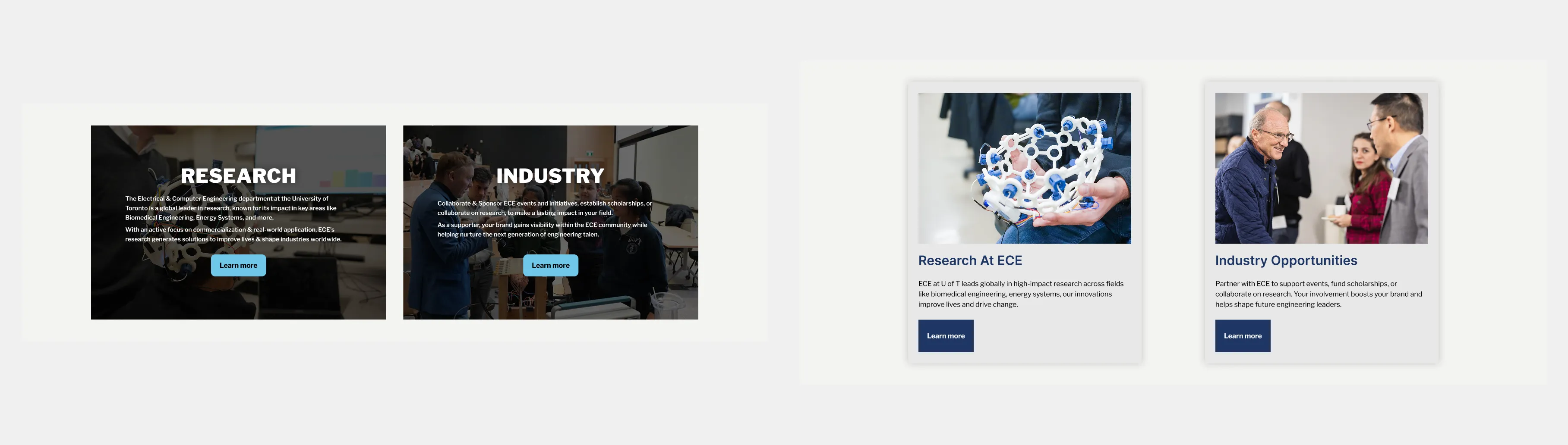
I consolidated the section into two clear pathways: Research at ECE and Industry Opportunities. This reduced repetitive navigation while giving industry engagement the same visibility as research.
The initial design (Left of High Fidelity Mockup) used immersive image treatments with overlaid text and calls to action. In the final implementation (Right of High Fidelity Mockup), I moved to structured cards with photography, clear typography, supporting descriptions, and dedicated actions. This made the two destinations easier to distinguish while keeping the section consistent with the rest of the homepage.