
During my time at University of Toronto's Department of Electrical and Computer Engineering (ECE at U of T), I explored how their digital experience could evolve to cater to the multiple audiences they served. The objective wasn't to reinvent the site — it was to identify opportunities to improve content discovery, student engagement, and partnership conversations while remaining faithful to the brand's identity. I conceived, designed, and rebuilt core parts of their public-facing website entirely by myself — reimagining the digital student experience, delivered as a responsive website across phone, tablet, and desktop.
ECE's website was in need of user experience-related enhancements. The website wasn't giving students a clear reason to explore the programs, nor providing an attractive proposition.
Faculty members needed to use it for professional outreach. Marketing couldn't use it effectively, mainly because some pages such as Events were underdeveloped. The site was maintained by multiple teams, while branding alignment was not strictly enforced.
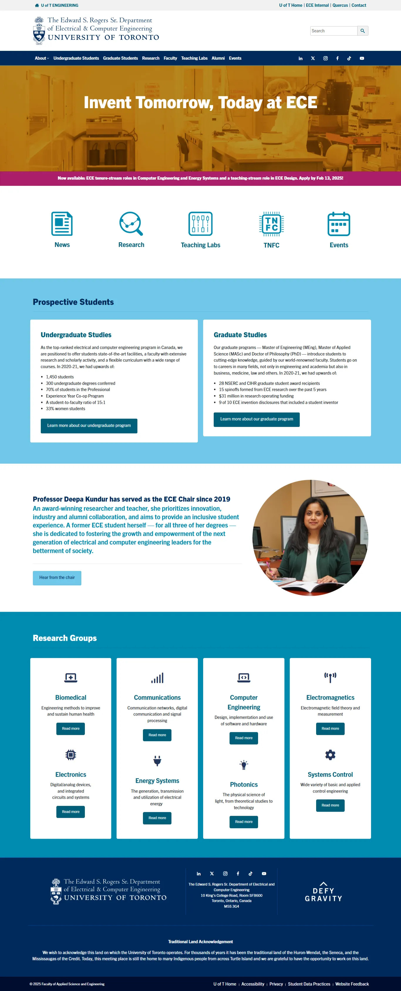
The ECE homepage when the project was greenlit.
What came back was clear: prospective students had to be the primary focus. Not because other audiences didn't matter, but because designing for the person with the least context currently meant the site would work better for everyone else too.
Audience A
The 17-year-old choosing an undergrad major
Thinking: Is this place serious enough to matter, and human enough to enjoy? Will I get access to real opportunities and and will I actually have a life while I'm here?
Audience B
The 22-year-olds and above weighing a master's or PhD
Looking for Credibility and Institutional weight. Access to research funding that justify the years they're about to commit.
I interviewed stakeholders to understand priorities, to find the one audience priority that could make every subsequent decision defensible. I studied competitor department websites across North America to understand what the bar looked like and where ECE had room to differentiate. I had informal conversations with students and faculty to understand what they were actually looking for versus what the site was currently giving them.
These are three workflow decisions that shaped my output.
I designed/prototyped in Figma for intial approval, but built the working draft directly in WordPress. Stakeholders saw the real thing and when reviewed, there was no translation loss.
I adjusted specific color elements within sections to redirect users, using negative space and contrast to pull attention toward what mattered.
The homepage was rebuilt in modular sections with reusable components and UI patterns. This ensured the site maintained UI consistency with the rest of the site.
I restructured the Homepage from the ground up into independent modular sections, each optimized for a first-time visitor. The goal was a page that pointed clearly inward, to internal pages that were actually of value to the visitors.
My design focused on making it be perceived as open, active, and easy to engage with, instead of users having to hunt through disconnected sections.
The ECE Website's Homepage had to perform well as a daily destination — the redesign expands its role into a gateway for the entire ECE ecosystem.
I had to make decisions that served both audiences without the site feeling split or generic. For eg, The Industry Opportunities page was built for industry partners. This was an original page for the website - targeting Industry Partners asking them to either "Work with us" and/or "Sponsor us," showcasing departmental metrics and opportunities for sponsorship.
But I designed it knowing a prospective student would read it and know that the department gets them access to the organizations they want to work at.
Built an original page for Industry Partners because the Department was active in the industry but didn't reflect it on the website.
Live LinkECE had an events page, which instead of introducing its event offerings, was originally a standalone calendar and list plugin. I transformed it into a structured Events page with event showcases, contextual information, and an embedded events widget, improving discoverability.
Instead of presenting events as a simple list, each event is surfaced as part of slider with category cards that let students quickly understand the breadth of ECE's events and identify those aligned with their interests, with the full calendar and list view accessible through the embedded widget. The experience thereby shifts from finding a event to discovering a like-minded community.
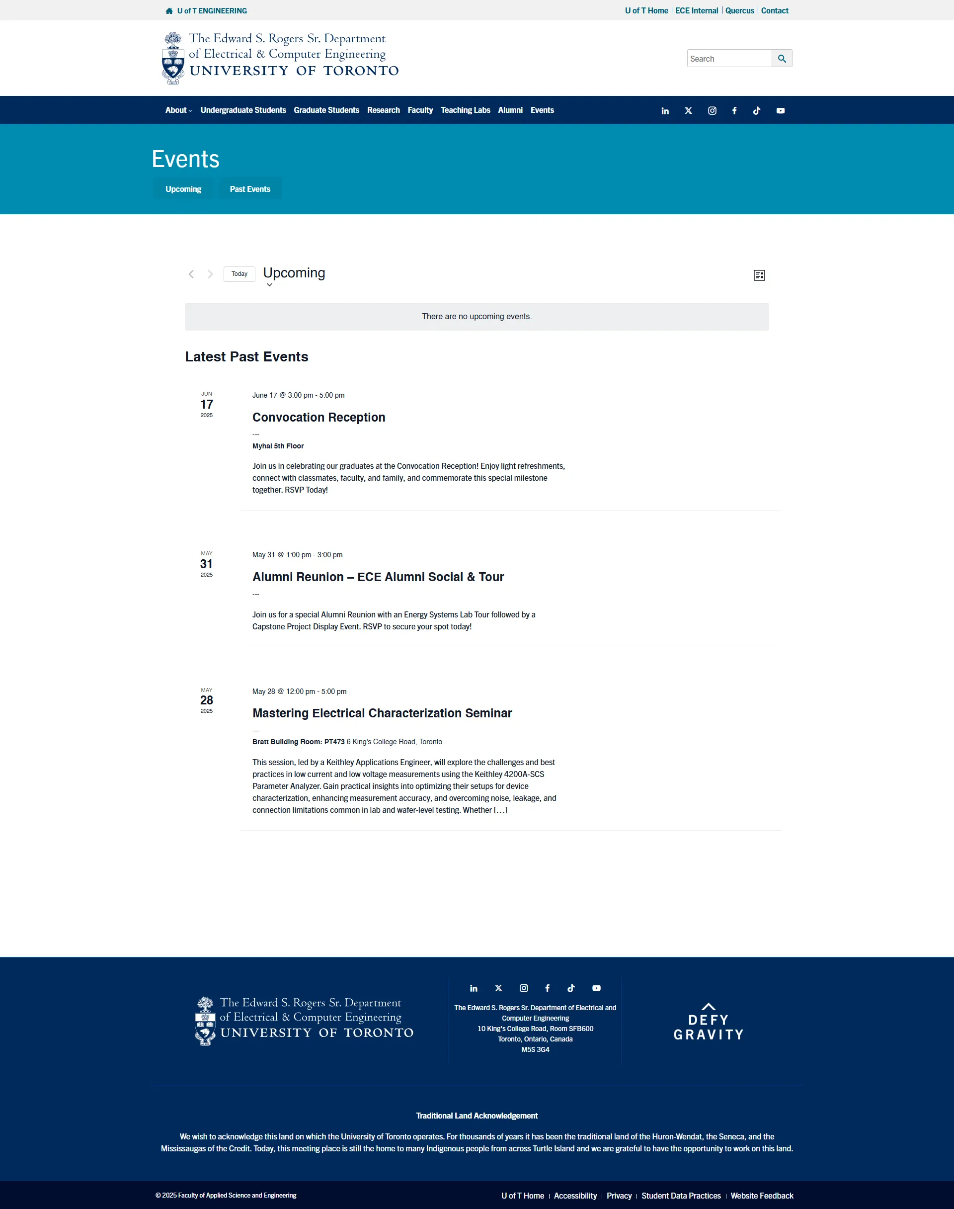
ECE's plugin generated Events page
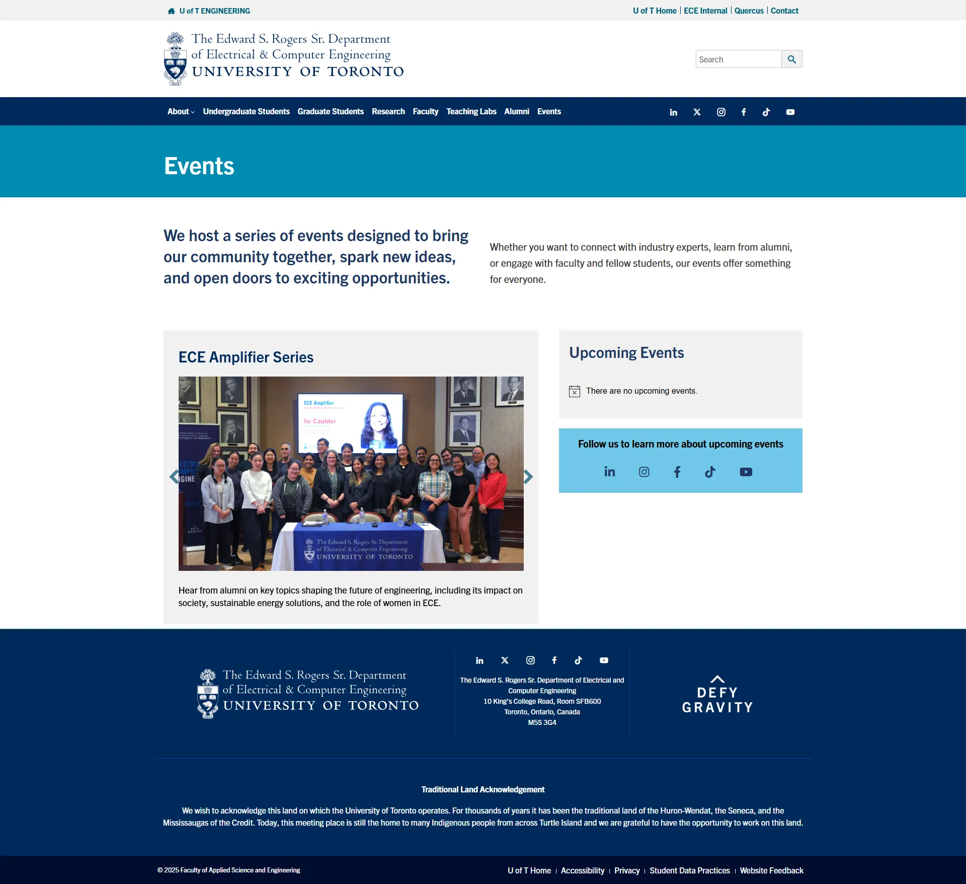
ECE's events page now
Built an original page, taking an auto-generated WordPress calendar widget page into a proper page with branding and contextual information, later integrated into the homepage through a widget.
Parallel to this project, I was also tasked with conducting research and auditing TNFC's standalone website. That audit raised a question worth asking department-wide: were there other properties in the same situation?
That question is what led to the component-library gap I addressed across the site. My approach therefore involved building patterns that could be duplicated and used as-is with copy edits by non-technical and non-design teams maintaining these pages. Continuing on this approach, the patterns built for TNFC could later be reused as-is for the Grid Modernization Centre's content hub, and adopted more broadly across other pages on the ECE website.
Despite being located inside the ECE department, TNFC labs had its own infrastructure, and no connection to ECE's brand or navigation. I consolidated this multi-page site into a two-page section native to ECE's digital environment.
Whether accessed from a phone between classes or a desktop for research, the experience remains consistent across devices. Responsive layouts, flexible components, and adaptive content ensure the same intuitive navigation and visual hierarchy across phone, tablet, laptop, and desktop.
This approach transforms a website into an ongoing information guide — faster, clearer, and more valuable for both people and the educational institution — while respecting the trust users place in their university during some of the most important moments of their lives.
A website comprises many different page types, each with its own content and user needs. Some required tailored UX enhancements — not to radically reinvent them, but to better emphasize information while consistently applying established university-wide design standards.
Similar to the Events page, the department's news articles existed only as individual WordPress-generated posts, with no dedicated repository or landing page for users to browse and discover content. Meanwhile, the department's researchers needed to display student opportunities, but the existing Research at ECE page wasn't designed to accommodate any type of job board.
A student-focused sub-page built under the Research page. Research access is a deciding factor for graduate applicants, and students needed to know they had these opportunities.
Live LinkA news and blog content hub, giving the department a content channel it could use as ongoing proof of departmental activity.
Live Link-- Message sent by Admin (after Mockups were approved).
Measurable reduction — figures on request
Measurable increase — figures on request.
Stronger flow to core website content
Sites that look right at launch but are too fragile for non-technical staff will eventually break down. Thereore, reusable section patterns and components weren't a nice-to-have, it was to ensure the work would last beyond my involvement.
Designing with prospective students as the primary audience solved two problems at once. It gave us a design direction and a political one. Every content request could be evaluated against a single question: does this serve prospective students? When the answer was no, that was a reason, not a preference. It turned subjective pushback into a conversation with stakes.