
I researched, designed, prototyped, and built ECE at U of T's Nanofabrication research lab website, converting it from a standalone website with inconsistent branding, to a responsive content hub integrated into ECE's public-facing website, working across phone, tablet, and desktop. To deliver it, I worked with the ECE comms and IT teams, additionally communicating with the Research Lab's admin for content design and decisions.
Despite being physically and structurally located inside the Electrical and Computer Engineering department (ECE), the Toronto Nanofabrication centre (TNFC) had its own CMS infrastructure, and no connection to ECE's brand or navigation.
I was tasked with auditing the standalone site and proposing a design-focused solution to improve its user experience. Instead, I proposed that the right move was to consolidate TNFC's multi-page site into a two-page content hub inside ECE's environment, rather than migrating the existing structure over as-is.
My approach centered around these two principles: Clarity — help people understand what TNFC is about. Simplicity — remove unnecessary friction from key tasks such as downloading and accessing forms.
I was given freedom with regards to how far the redesign could go and what the final architecture would look like.
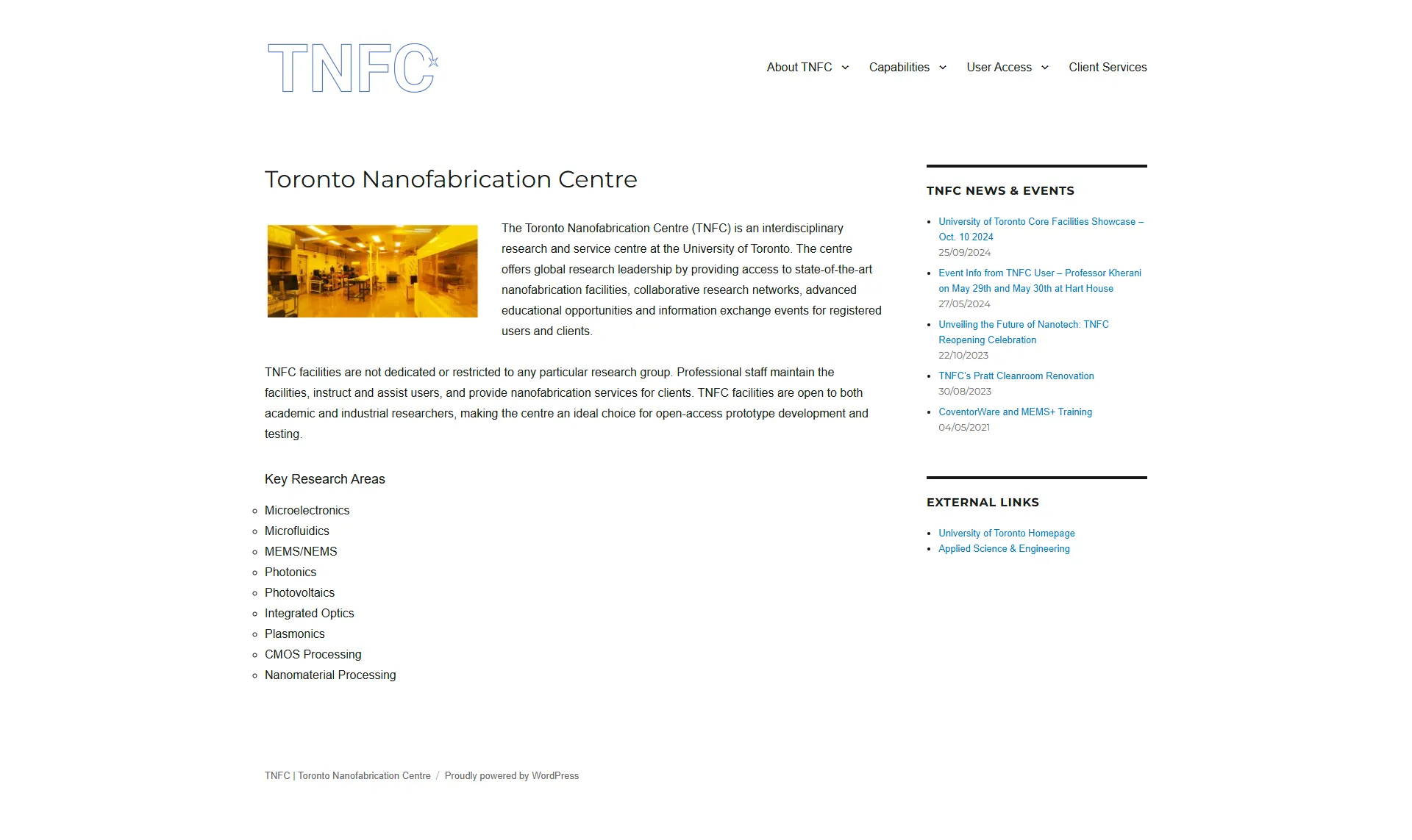
The TNFC homepage when the project was greenlit.
The obvious answer was to do a visual overhaul of the existing website using the university's branding and design guidelines. This wouldn't have helped as the site would still exist outside of ECE's ecosystem.
Stripping away the auto-generated architecture on the existing website revealed two genuine content needs: a home page that explained what TNFC was and what it offered, and a user access page that gave users everything they needed to book and use the facility.
Nearly every page on the old site was written as if the reader already knew what TNFC was; the one exception was the User Access section, with subpages like User Training and Access Forms that walked through "onboarding" steps.
TNFC also had its own standalone News and Blog feed. This was an easier answer: I had just helped build the blogs and news feed on the ECE website, which could easily takeover the TNFC content.
Explained what the lab was, what it offered, and positioned it clearly as a research facility. All original top-level page content consolidated into scannable sections.
Live LinkAll forms, processes, policies, and compliance requirements in one place instead of five sub-pages.
Live LinkTNFC's original home page read like an institutional bulletin board. But, the biggest disconnect was the visual inconsistency with U of T’s brand.
The original page used a very plain layout, weak hierarchy, and a dated left-content/right-sidebar blog structure that doesn’t feel like a modern institutional service site.
My design focused on making it be perceived as open, active, and easy to engage with, instead of users having to hunt through disconnected sections.
The TNFC homepage when the project was greenlit.
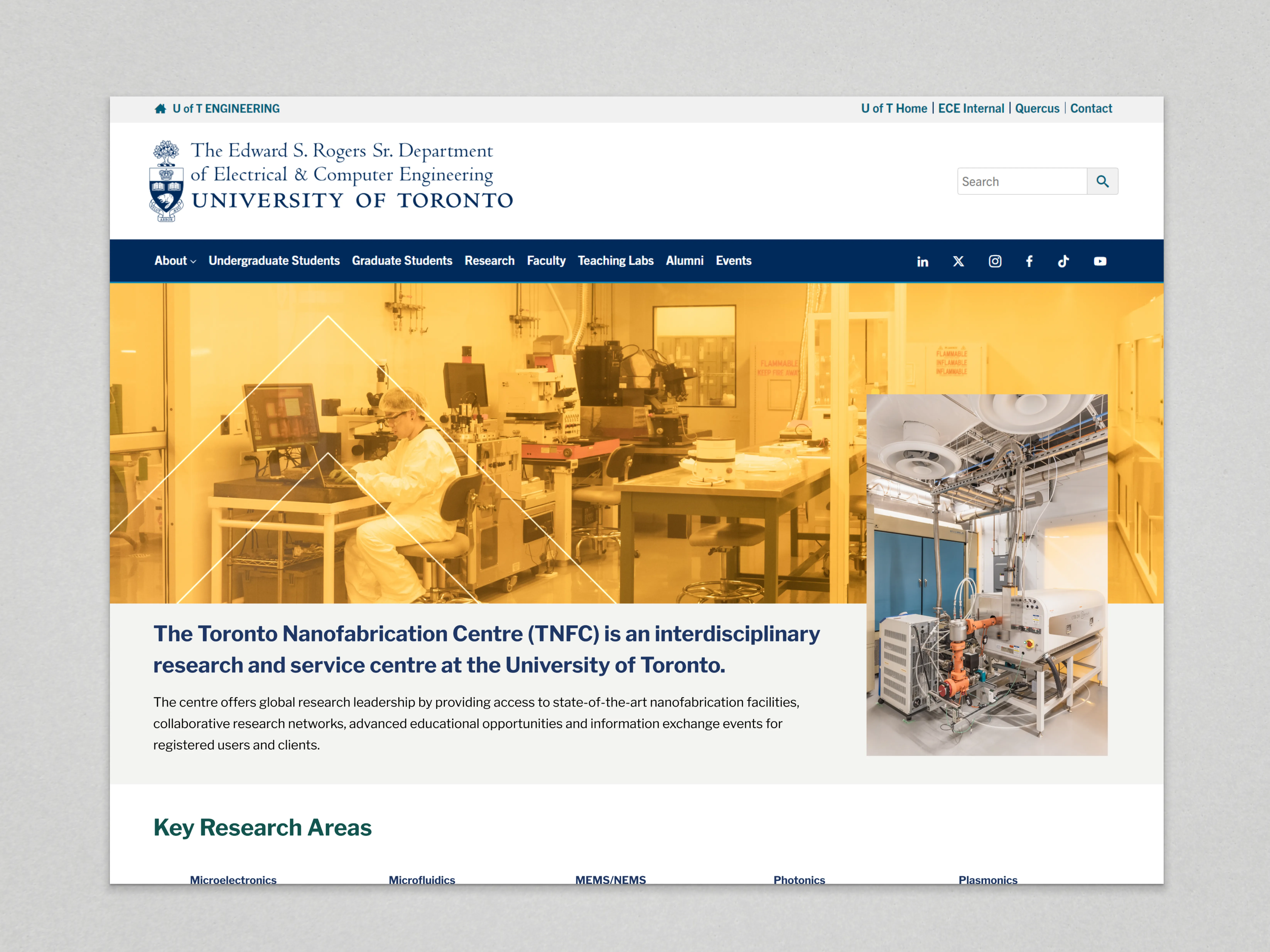
My Content Hub Design - Desktop (Click to view Full Design)
TNFC had 2 lab facilities, instead of being easy to access, was hidden under About Us. I integrated it into on the TNFC home page as a structured card-based grid, reducing click depth.
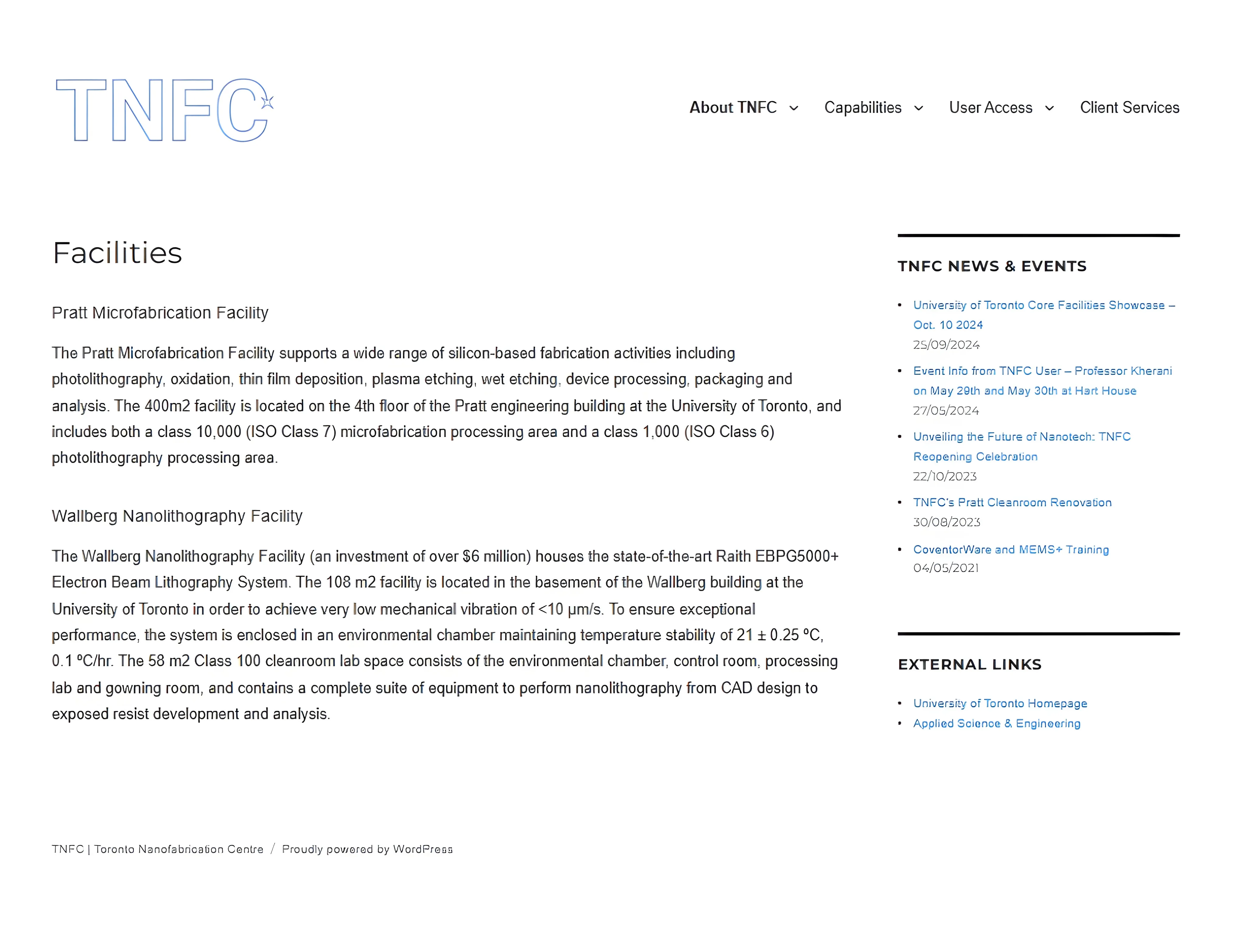
TNFC's Facilities Page (Original)
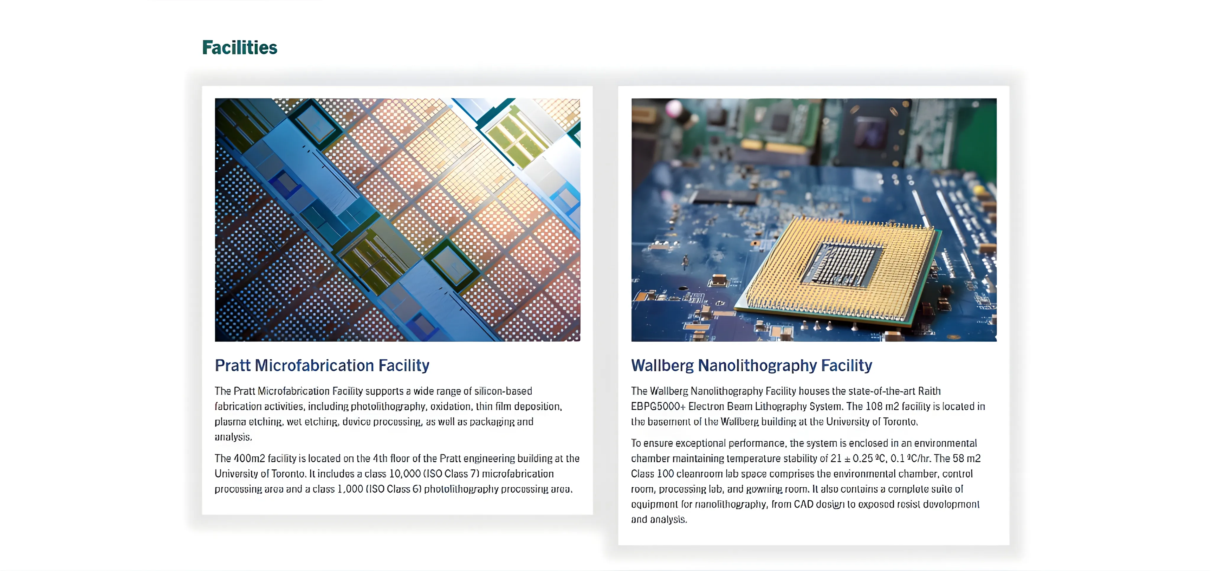
What it looks like now
A benefit of this approach is that the components could be extended by simply duplicating an existing block to add more facilities or services as and when required. This was planned from the start. ECE's website had no shared component library at the time, so every page was rebuilding similar UI patterns from scratch. Designing TNFC's components to be duplicated rather than rebuilt was a deliberate step toward fixing that gap.
Most of the top-level pages were auto-generated link aggregators, not real content pages. The actual information was buried in sub-pages that users had to navigate to independently.
Take User Access, an important page on the site. The five subpages had content that could be consolidated into a single page without having to erase or deprioritize any critical information.
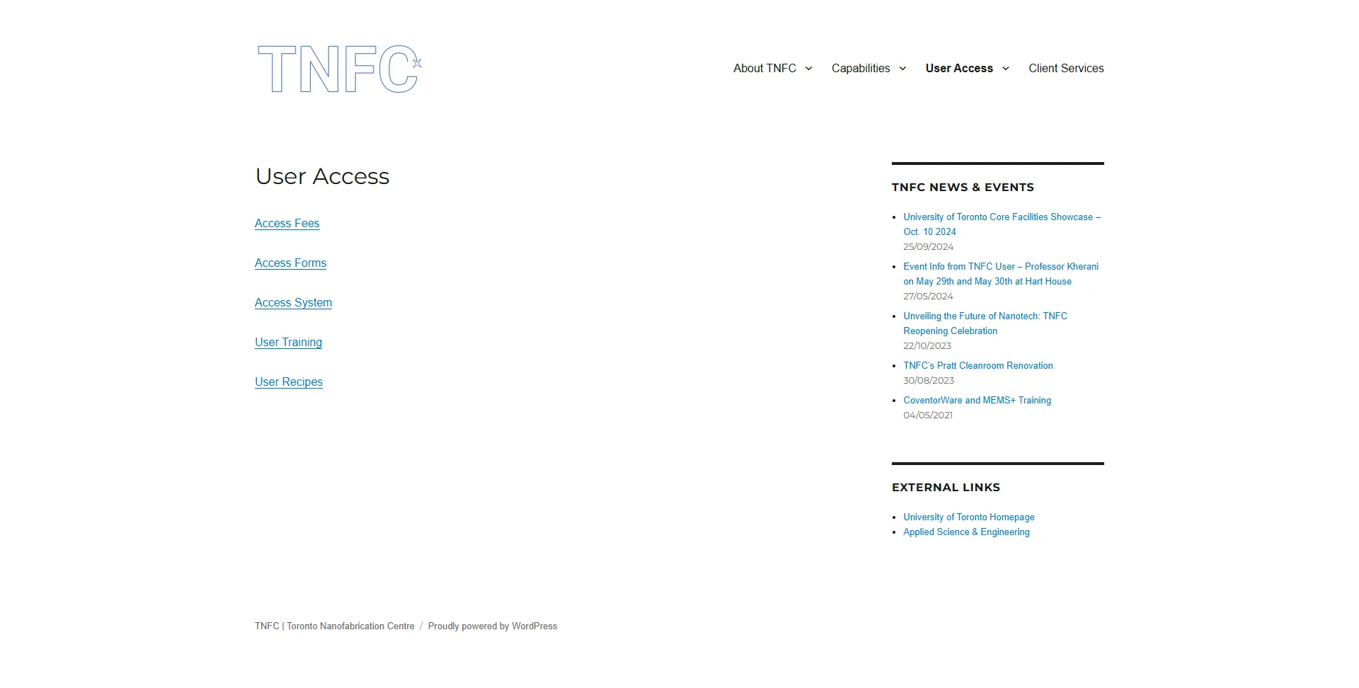
TNFC's User Access Page
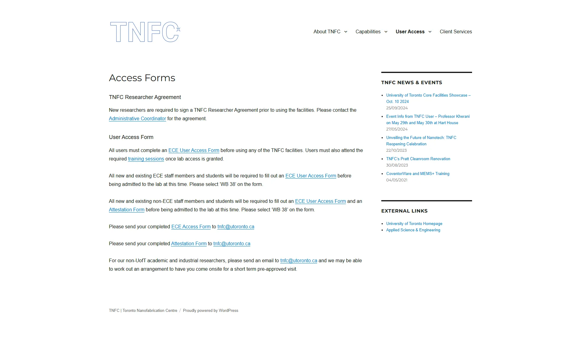
TNFC's Access Forms Page
One of its subpages, Access Fees, consisted primarily of long pricing tables. I suggested converting it into a downloadable PDF, accessible via a single CTA on the User Access page, rather than porting the tables into the new site's design system.
TNFC had information about partner organizations, which instead of being easy to recall, was originally a text-based list of hyperlinks on a Partners subpage under About Us.
I integrated it as a three-column section with an auto-scrolling logo gallery on the TNFC home page, improving partner recognition.
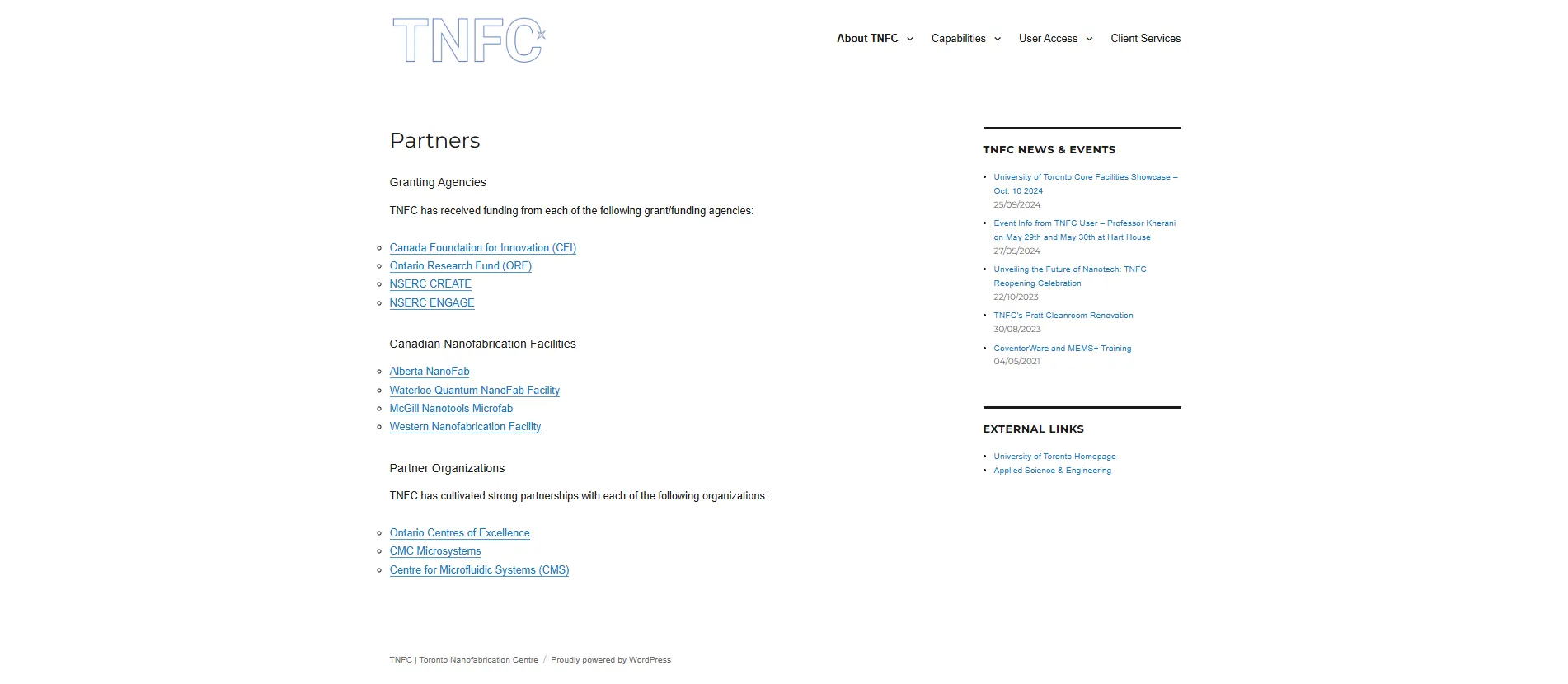
TNFC's Partners Page (Original)

What it looks like now
My original design included "Equipment Capabilities" (a subpage on the existing website) as a similar section on the home page. The decision to add it to the content hub as a second core sub-page was made after I left. Due to my planned modularity, the organization was able to reuse my existing structure and other reusable components from the website to add a second page for Equipment Capabilities.
No one interacts with a website from a single device. TNFC was designed responsively from the first frame, delivering a consistent experience across mobile, tablet, laptop, and desktop.
Every layout, component, and content section was built to adapt fluidly across screen sizes, ensuring navigation remained intuitive and information remained readable regardless of how students accessed the site.
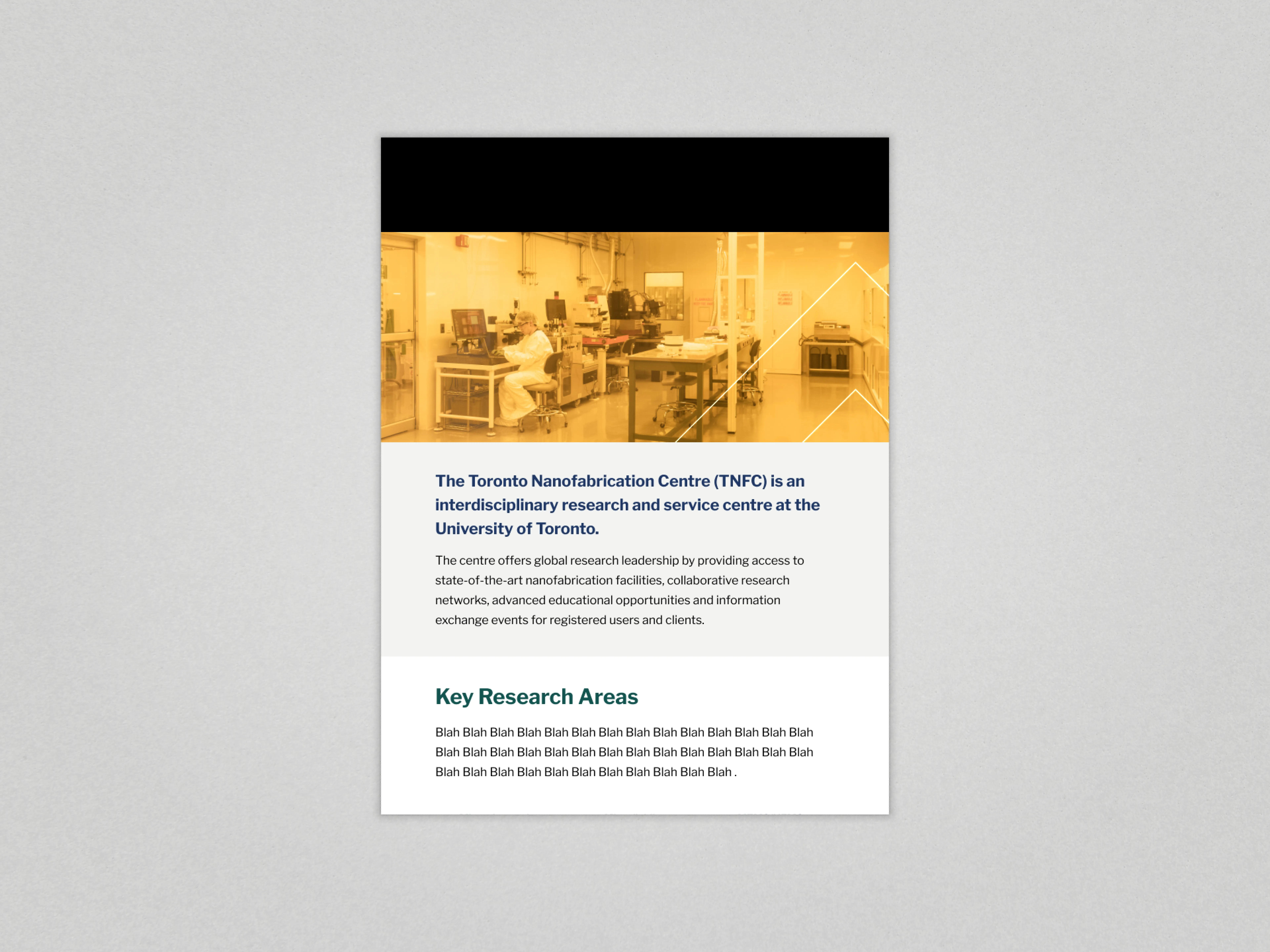
My Content Hub Design - Tablet (Click to view Full Design)
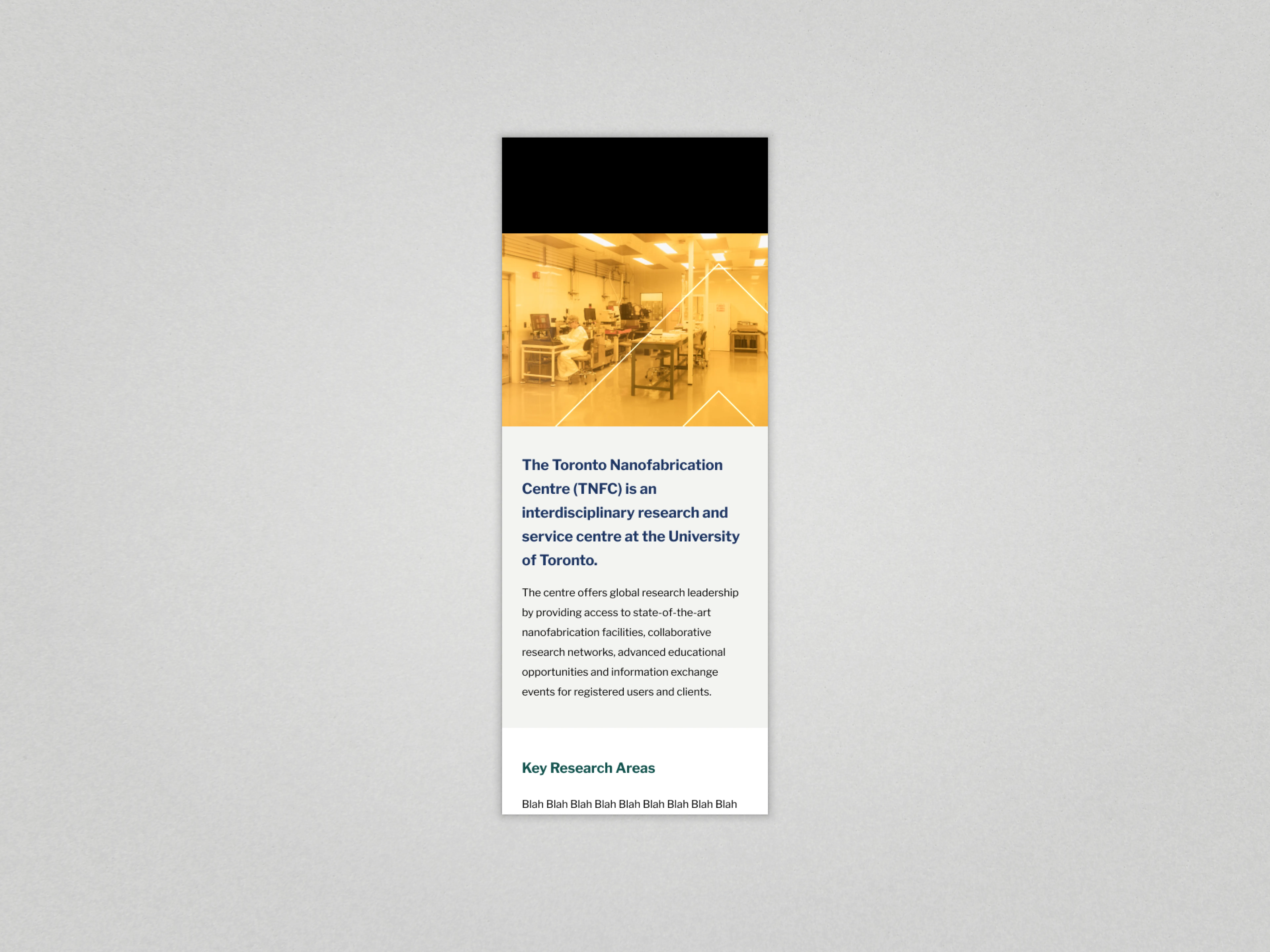
My Content Hub Design - Mobile (Click to view Full Design)
TNFC looks and feels like ECE, not a separate organization.
The pattern can be reused for future facilities that need a subsite.
Users can find TNFC without leaving ECE's primary website.
Every design decision was driven by the need to ensure ease of access to the regulations, including access, training, billing, and safety. At the same time, the pages were designed to feel native to ECE while also expressing TNFC’s identity and values. The result positions TNFC as a core, high-value research facility within the department.
The prototyping for the TNFC homepage and its intial sub-page was done in under two weeks — because I wanted working drafts in front of stakeholders early.
Why? There were a couple of design decisions that non-design stakeholders couldn't envision at first. My working drafts and prototype were instrumental in ensuring they weren't approving something they misunderstood or required major rework late in the process.
The approvals process took much longer than anticipated which caused the project to be in the final phases of web development during the final week of my contract — causing a rushed production of assets and finalization/visual polish. Other delays were mostly scheduling related and not design/development related.
After I left, development on other parts of the site reused components and patterns that were originally designed for TNFC's section, including the Grid Modernization Centre's new page. The patterns were picked up and used after I left — not only were my components and patterns liked — the structural decisions made sense and they were also repeatable.