UX Researcher (Team of 4)
UX Research:
Jan 31 - Feb 24, 2025
UI Design:
Mar 3 - Mar 24, 2025
Competitive & Comparative Analysis, Research Plan, Key Insights, Design Recommendations, Presentation Deck
FigJam (for Analysis)
Google Forms (for Surveys)
Microsoft Word & PowerPoint (for Notes & Presentations)
Google Drive (for Documentation)
Zoom (for Interviews)
This project was part of a UX research sprint aimed at improving a virtual museum’s web platform. The client wanted to understand how users interacted with digital exhibitions and learning resources, and how the site could better serve both casual visitors and educators.
I co-led the end-to-end UX research, collaborated on synthesis, and proposed interface changes based on the findings. This case study focuses on how I use research to directly inform UI design decisions.
Clarify Site Navigation
Does the navigation help users intuitively find exhibitions, resources, and learning tools without confusion or backtracking?
Benchmark Against Industry Leaders
How do other virtual or hybrid museums structure their platforms, and what can we learn from their engagement strategies?
Design for Growth & Discoverability
Can the site design support future exhibitions and evolving content while maintaining a clean, user-friendly structure?
Address Accessibility & Usability Issues
What improvements can be made to ensure the site is accessible, engaging, and easy to use for diverse user groups?
To explore how users engage with virtual museum content, We used a mixed-methods research approach that combined desk research, competitor analysis, surveys, and 1:1 Zoom interviews. This helped us ground the redesign in real user behavior and expectations.
I studied current UX trends in virtual museums, focusing on accessibility, content structure, and engagement. Reviewed published case studies and reports from cultural institutions and design firms.
I analyzed navigation structures, interaction models, and exhibit entry flows from hybrid and fully virtual museums for strengths, friction points, and opportunities.
All four team members collected data from survey participants and Team member (2) conducted usability interviews. I helped design the questionnaire and usability tasks, also Thematic Analysis of all data.
The following images, from three sample competitors - VOMA, MOLAA, and Manitoba Museum, each an example of the 3 categories mentioned above, were studied to help identify patterns & navigation strategies.
They use similar layouts to provide access to and promote their virtual experiences.
Educational institutions are frequently targeted, suggesting a strong educational component in digital strategies.
Digital/virtual experiences are made accessible through various links, pages, and sections, giving flexibility in how they interact.
Prominent calls to actions guide users from initial exposure to fully engaging with the virtual experiences.
The current navigation menu is not user-friendly, and IA is confusing, making it difficult to find relevant content.
The website has outdated design layouts and elements, affecting engagement.
Users struggled to identify the available features and calls to action (CTAs) on the site.
The site presents too much information, leading to difficulty locating key content.
Restructuring the Site Map and Navigation Menu for clearer, more intuitive navigation.
Optimizing the Content Layout/Structure to ensure content is more accessible and well-organized.
Establishing Style Guidelines & Design System to create consistent design elements and a cohesive visual language that aligns with the museum’s brand.
This section shows how user insights were translated into clear, purposeful interface decisions. Unfortunately due to the NDA, I cannot reveal what the original site looked like, but the UI designs I made here are based upon the insights obtained previously.
I suggested a shift from a submenu-based access model to a hub-style landing page for educational resources. This card-based hub solves for unclear CTAs, overwhelming menus, and scattered content pathways found in the original experience.
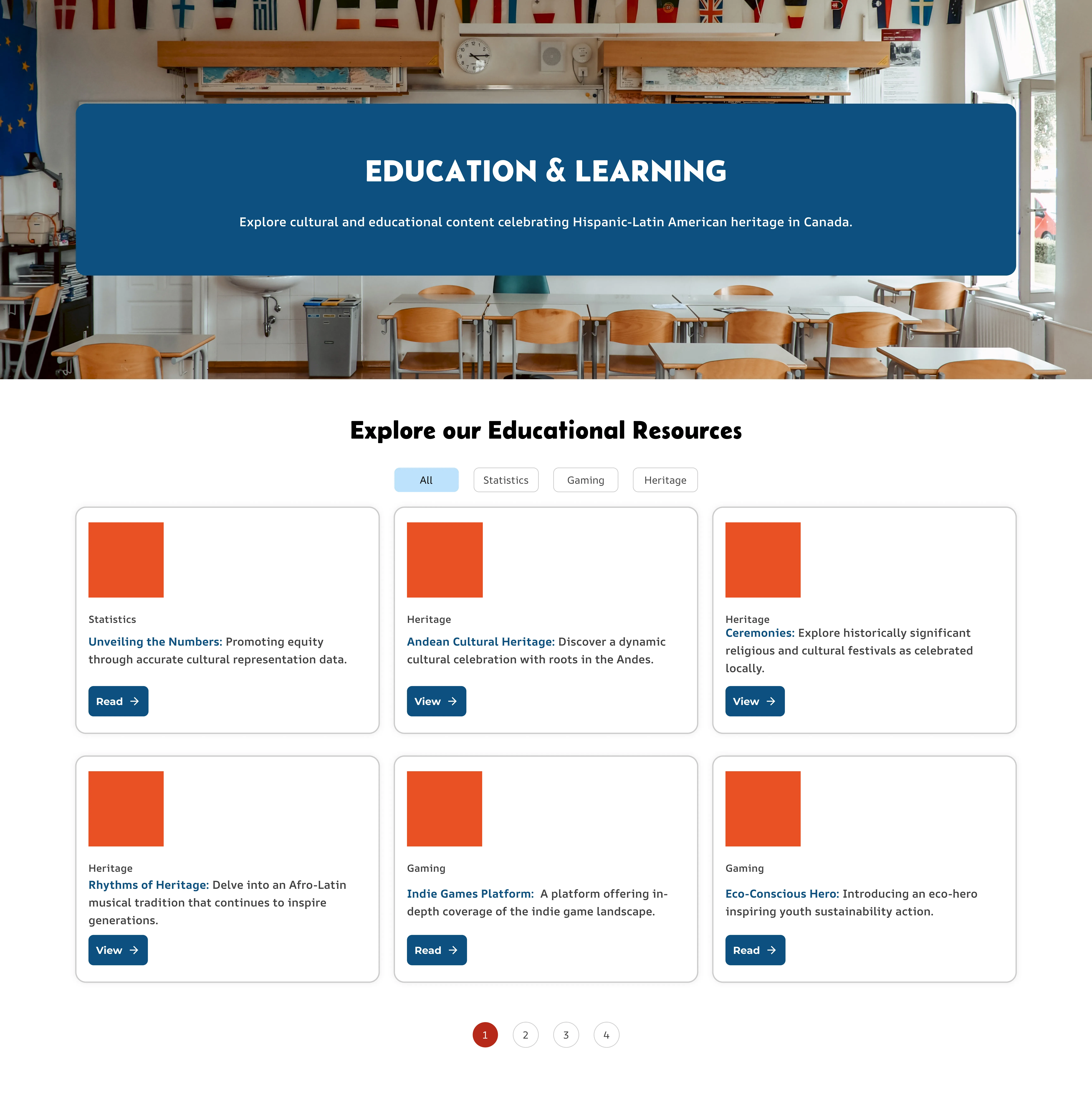
All educational resources are now in one place — no more digging through menus.
Each resource card includes a clear ‘Read’ or ‘View’ action so users know what to do.
Short descriptions and visual tags help users scan and find content quickly.
Tag filters let educators quickly sort by themes like heritage, gaming, or statistics.
I suggested a shift from a static flag-and-link layout to a more dynamic, dropdown-based model. A dropdown design simplifies navigation, reducing visual clutter while making it faster to find the correct embassy or consulate.
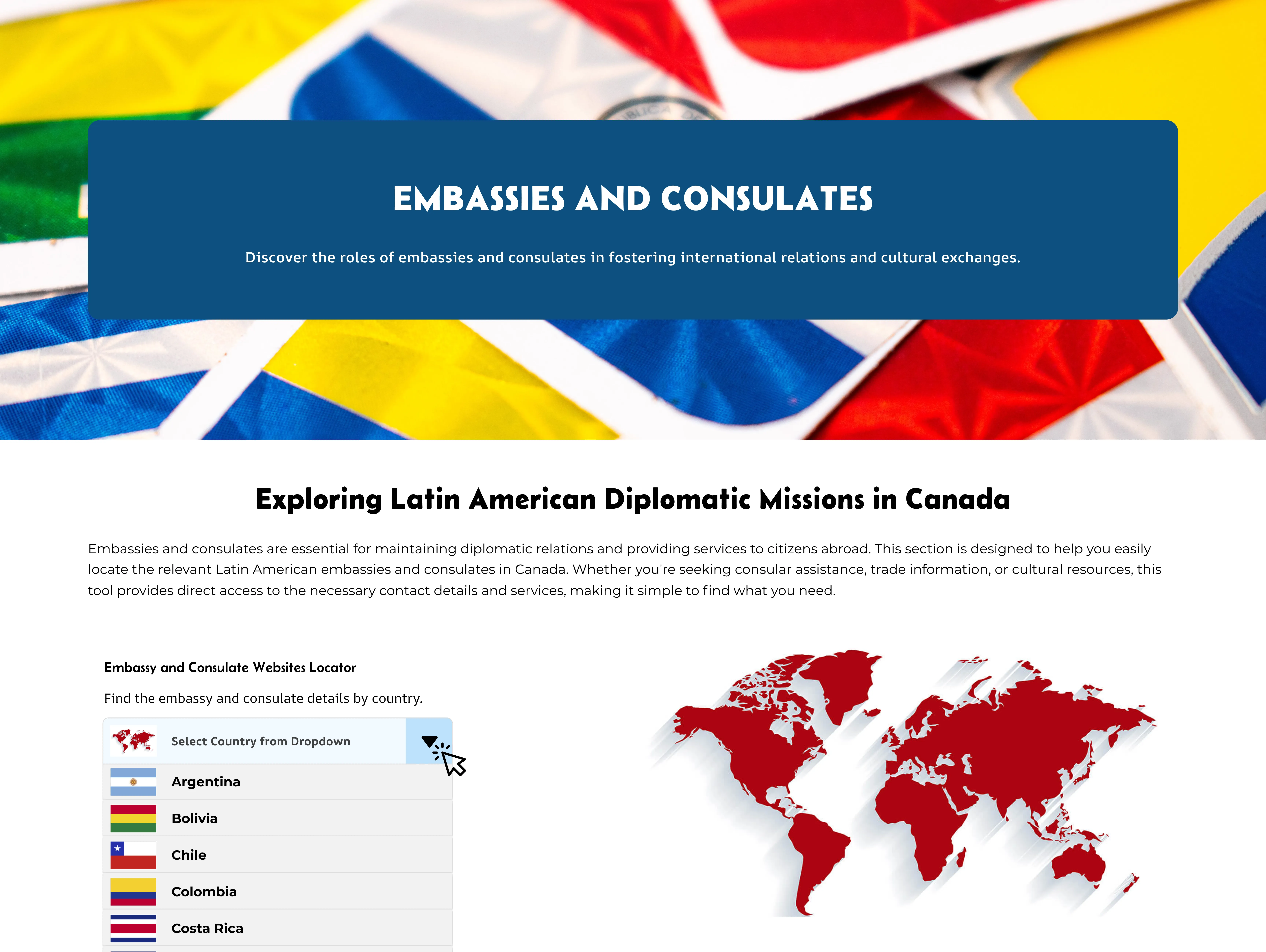
Dropdown improves navigation by grouping country selections in one place, making it easier to find the relevant embassies and consulates.
By hiding unnecessary links under a dropdown, users can focus only on the information that matters to them.
The dropdown consolidates it into one organized area as only relevant embassy and consulate links appear after selecting a country.
This project demonstrates how user research can directly shape interface decisions for online cultural platforms. Although the final UI designs are covered by an NDA, the recommendations were grounded in data collected through competitor analysis, surveys, and user interviews.
We identified key issues in the original experience, including confusing navigation, scattered content, and unclear calls to action. Each insight led to specific, practical design suggestions that improved the site’s structure and clarity while supporting future growth.
Key Takeaway: Research-Driven Design
My approach centered on turning real user feedback into purposeful UI strategies. This case study shows how I use research to guide design decisions that make digital spaces more engaging, intuitive, and accessible for diverse audiences.