floating image button

App for the GLAM sector (Galleries, Libraries, Archives, and Museums)

EXPTo (Experience Toronto) App

EXPTo is a ticket and discounts discoverability mobile application designed during the 'Fundamentals of UX Design' course as a team. Designed for Toronto's GLAM sector, its goal is to make it easier to find discount information.

My role was UX Research, UI Design, and Prototyping

My team included Quinn Kavaner, Vivian Zhang, Kyle Thomas, Ankush Sood, Rebecca Ding. While the UX research was done as a team, the team split into pairs to do creative direction, low-fidelity prototyping, and testing. Kyle and I did prototyping. After the course concluded, I did the component design and high fidelity design based on the feedback we received on the low-fidelity prototype.

UX Research & Design

Oct – Dec 2023

Component Design

Winter 2024

Tools

Figma, Miro

Type of Product

Mobile App

UX Research

36 survey participants. 12 interviews. Market data spanning pre- and post-pandemic attendance. All Three sources pointed to the same pain point. Discount programs already existed; people simply couldn't find them.

Key Data Point: 24 respondents said they'd visit museums more often, if discount information were simply easier to find.

CA$ 30+

Raise in Ticket prices at major museums like the ROM and AGO, limiting attendance and audience reach.

350K ▼

was the 2022 attendance at The ROM, compared to 1.2Mn in 2019, suggesting post-pandemic challenges.

CA$ 0!?

Many Torontonians are unaware of free admission times because the information is scattered across sources.

25 of 36

Survey Participants find ticket and discount information online, showing demand for easily accessible content.

18 of 36

Survey Participants would visit the museum more frequently if discount information were easier to access.

6 of 12

Interview Participants identified challenges in accessing discount information, highlighting usability issues.

This is why we decided to design a one-spot app for GLAM ticket discounts and offers.

Low Fidelity UI

Based on our research, we designed a low-fidelity prototype that had a search-first information architecture, with a map feature that allowed users to find nearby events.
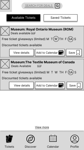
Home Page
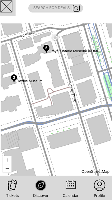
Discover Page with Map feature

High Fidelity UI

Component Design

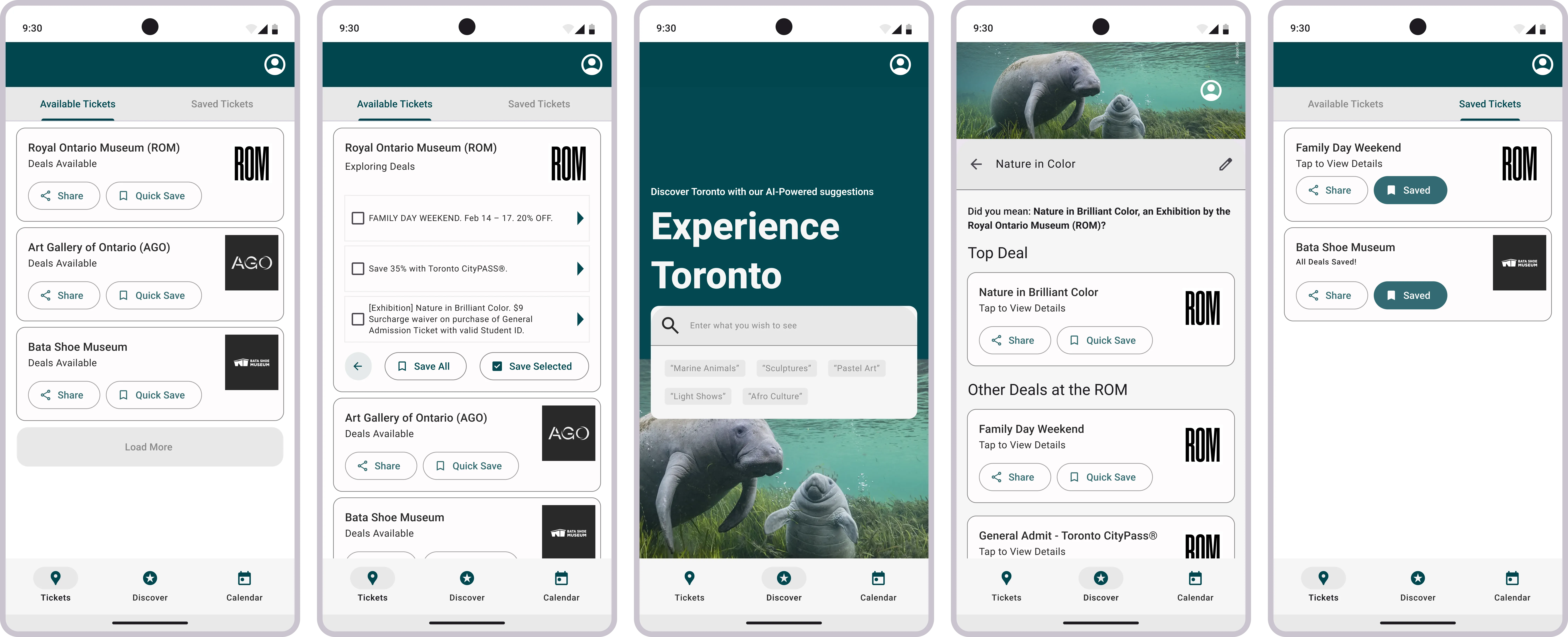
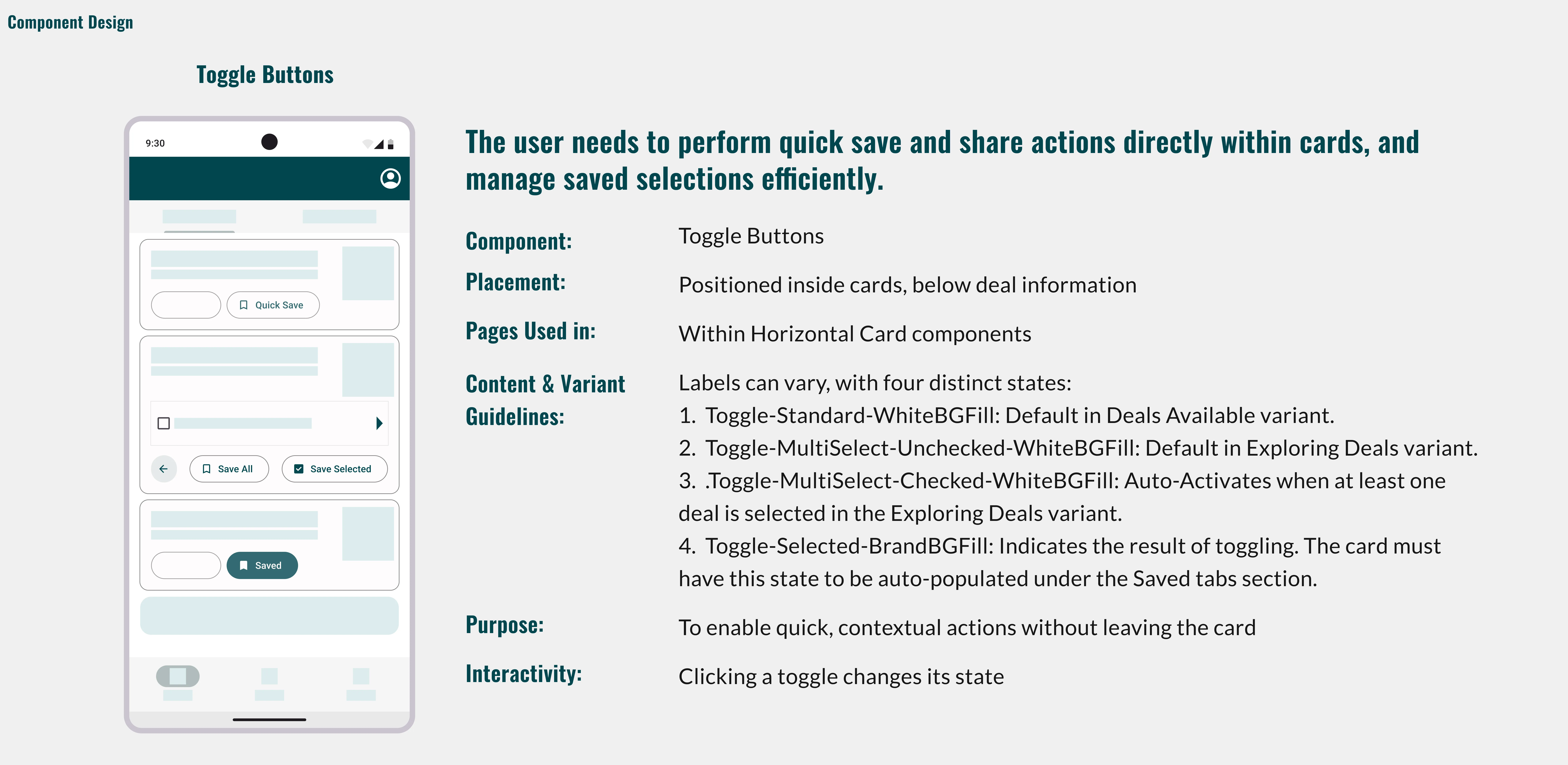
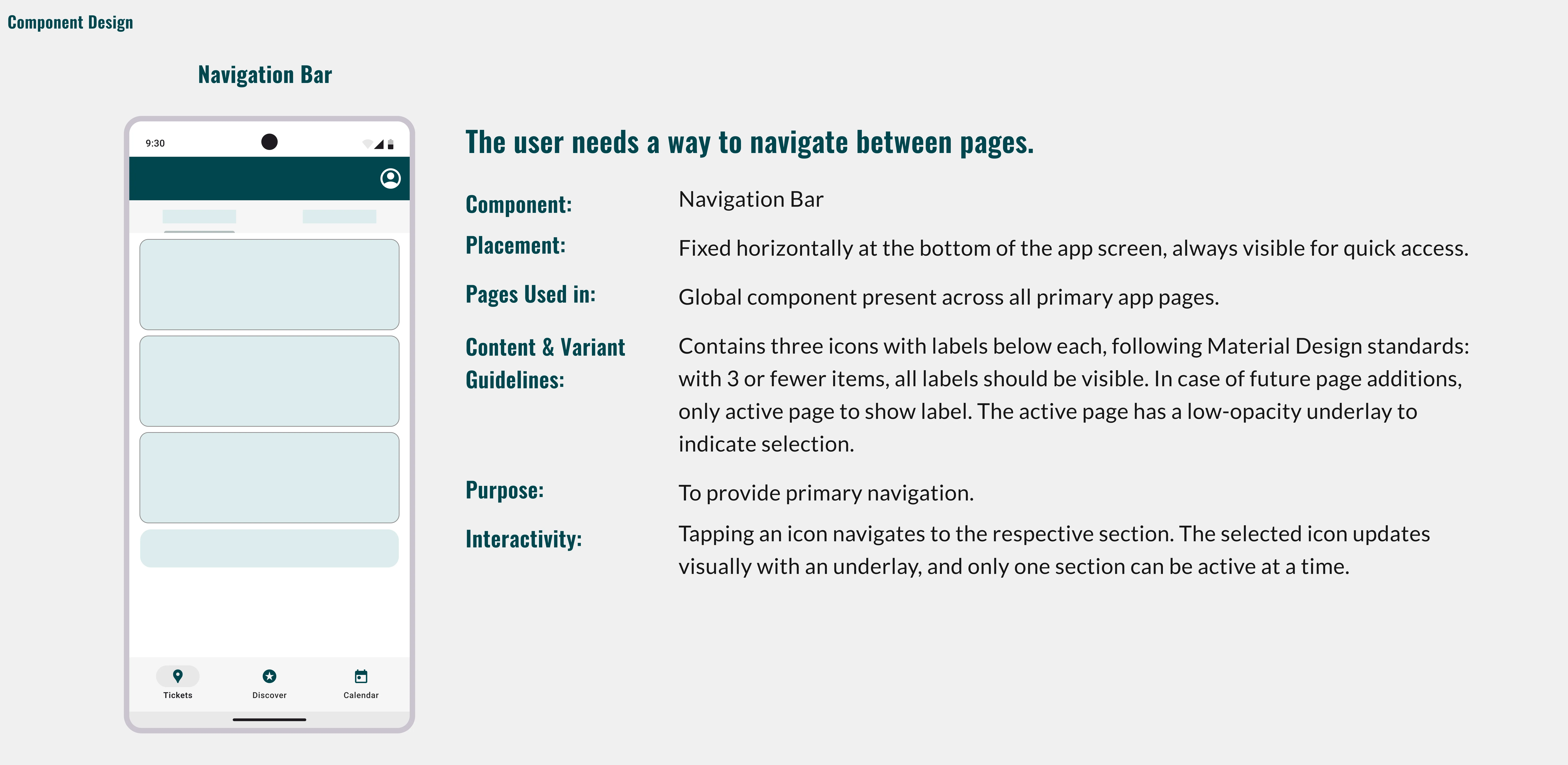
The high-fidelity component system was built by myself individually after the course ended, using lo-fi feedback as the brief.

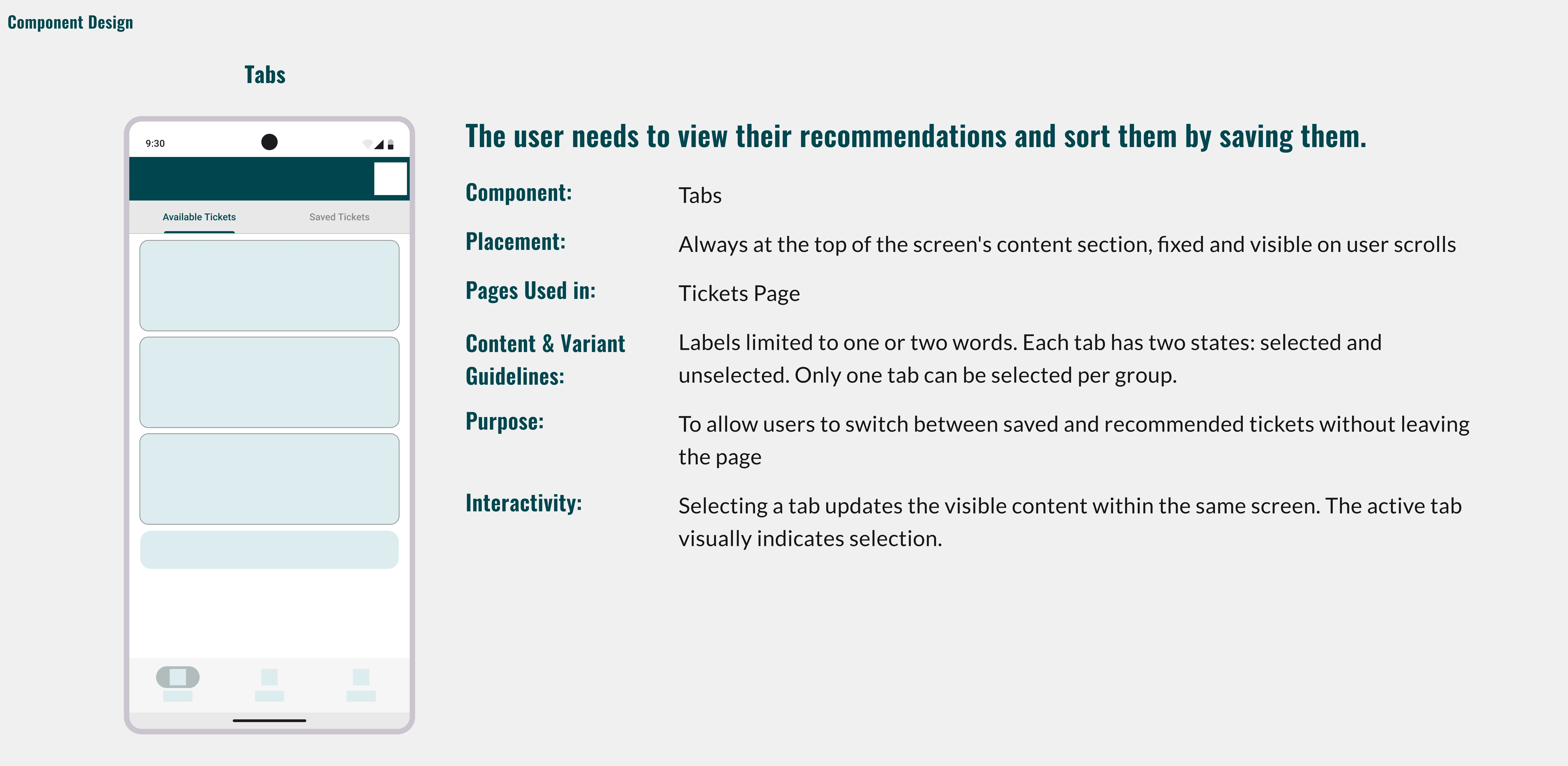
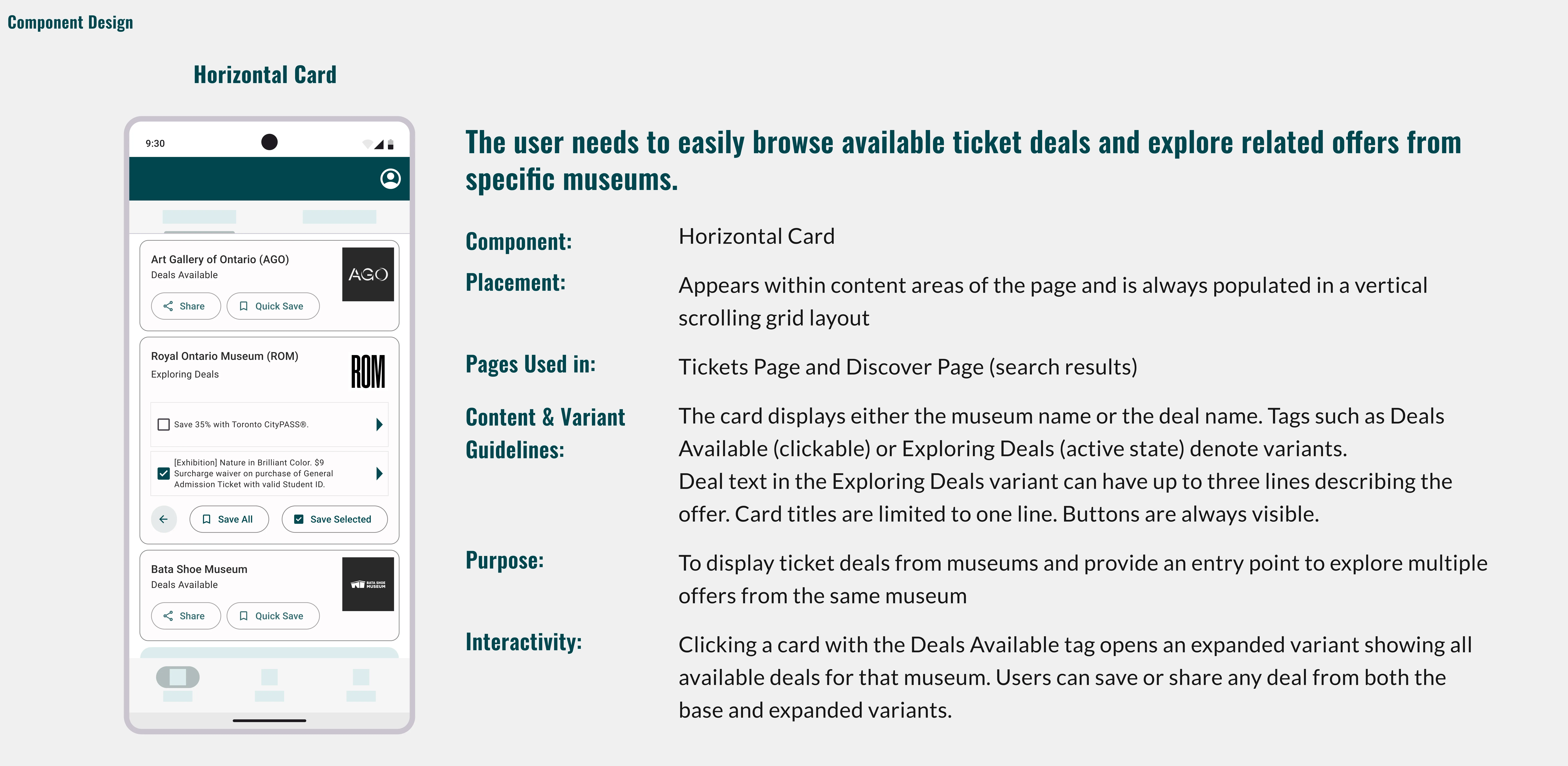
What Changed between the Lo-Fi and Hi-Fi UI Design stages?

The Map tested well in low-fidelity. But, Museums don't share data in a way that would allow us to build the map feature, and feedback showed that building it would have been a distraction, adding visual clutter that didn't address the problem. The pivot to search-first was an IA decision that matched the product's technical constraints while directly serving what research confirmed users actually wanted.

What I Learned

Design decisions made purely from user preference can be fragile. Decisions made purely from technical constraint can miss the point entirely.
Coming back to rebuild the UI after the course also told me something simpler: a prototype good enough to present isn't the same as work that's actually finished.
Many decisions we'd made when designing the Low fidelity version came apart when moving to high fidelity, which were also based on input I received from peers on how it would look like if potentially handed off and developed.