Turning an academic homepage into a student recruitment portal

ECE Homepage Redesign

Read Case Study ↓
Domain
Education
Role
UX/UI and Front End
Duration
Jan – Mar 2025
Deliverables
Mockups + WordPress Site
Tools
Figma, WordPress
ECE Home Page Mockup

ECE HOME PAGE

Project Goals

Prospective students have questions. However, answers aren't always easy to find.
At the same time, We had a strong story to tell: one of innovation, opportunity, and research excellence.
It wasn’t a lack of content.
That’s when it became clear: This wasn’t just a redesign. It was a chance to reframe how the department welcomed future students.

This project aimed to transform the University of Toronto’s Electrical & Computer Engineering (ECE) department homepage into a compelling, student-focused digital experience.
Traditional Academic Websites

Well-intentioned, Content-rich
but often hard to navigate

1 Help Recruit Prospective Students
2 Be an Access Portal
3 Be Representative
Challenges

Surface Key Gaps in the Existing Page
Outdated visuals, vague research info, no co-op details, and low event visibility.
Design for Visual Clarity and Action
Text-heavy layout with few visual cues or CTAs to guide users.
Align with U of T’s Brand Standards
Inconsistent application of U of T guidelines compared to other FASE departments.
Design process

The solution wasn’t simply improving layout or updating visuals; it was about fundamentally rethinking the homepage’s structure.
We had to enhance Clarity and Visual Hierarchy.
This meant starting with a comprehensive design audit and competitive research to pinpoint gaps and identify best practices.

From there, wireframes and mockups were created to establish a new direction.
Core Design Deliverables & Activities
Step 1: UX/UI Design

Tasks such as Design Audit, Competitor research, Wireframes, and High-fidelity Mockups.

Brainstorming Icon

Brainstorming & Ideation

To Explore multiple layouts + UI ideas and visualize the redesign direction.

Research Icon

Research

To Benchmark functionality and appeal.

Wireframe Icon

Wireframes & Mockups

Create high-fidelity designs and visual mockups using Figma.

Step 2: Website Development

Tasks such as Developing using WordPress + Apply UI Element Animations, and Check Responsiveness.

Brainstorming Icon

Website Building

Designing/Developing the Webpage on the CMS.

Research Icon

Interaction Design

Animating the sections.

Design Audit

Design Elements Purpose of Element Already Exists? Redesign Needed? Narrative Order
Hero Banner Draw in People Yes, not student-focused Yes 1
Interactive Banner Jobs & Events Exists, but inactive No 2
Quick Links Navigate site Exists, poorly styled Yes 3
Important Facts Why join ECE No, outdated content Yes 4
Programs of Study Highlight offerings Yes, 2020–21 content Yes 5
Chair’s Message / Events Welcome & Events Chair exists, not Events Yes 6
Other Highlights Research & Co-op Research links exist Yes 7
Existing Hero Banner Practices
Snippet Snippet Snippet
UI Element Ideation
Website Development

With feedback from internal teams, the approved mockups were implemented directly into WordPress—translating design into a responsive, student-focused homepage.
We built a homepage that informs, invites, and reflects the department.
Key updates included a prominent hero banner featuring the department slogan and ECE experience.

Important content like facts, programs, and events were restructured for clarity, with bold headings and visual emphasis.

A new events section was introduced, and research & industry opportunities were spotlighted with clear calls to action.
Requirements for a Meaningful Redesign

Student-Centric, Visually Clear
and aligned with brand standards

1 Surface Key Gaps in the Existing Page
Outdated visuals, vague research info, no co-op details, low event visibility
2 Design for Visual Clarity and Action
Reduce cognitive load, increase CTA visibility, improve layout hierarchy
3 Align with U of T’s Brand Standards
Correct inconsistent styling compared to other FASE departments
Final Outcome

Up-to-date and Modular
Customizable and campaign-ready by design

1 Helps Recruit Prospective Students
Provides information and links to aid student decision-making
2 Functions as an Access Portal
Showcases strengths, programs, and opportunities clearly
3 Represents the Department
Accurately reflects identity, values, and tone

Takeaways

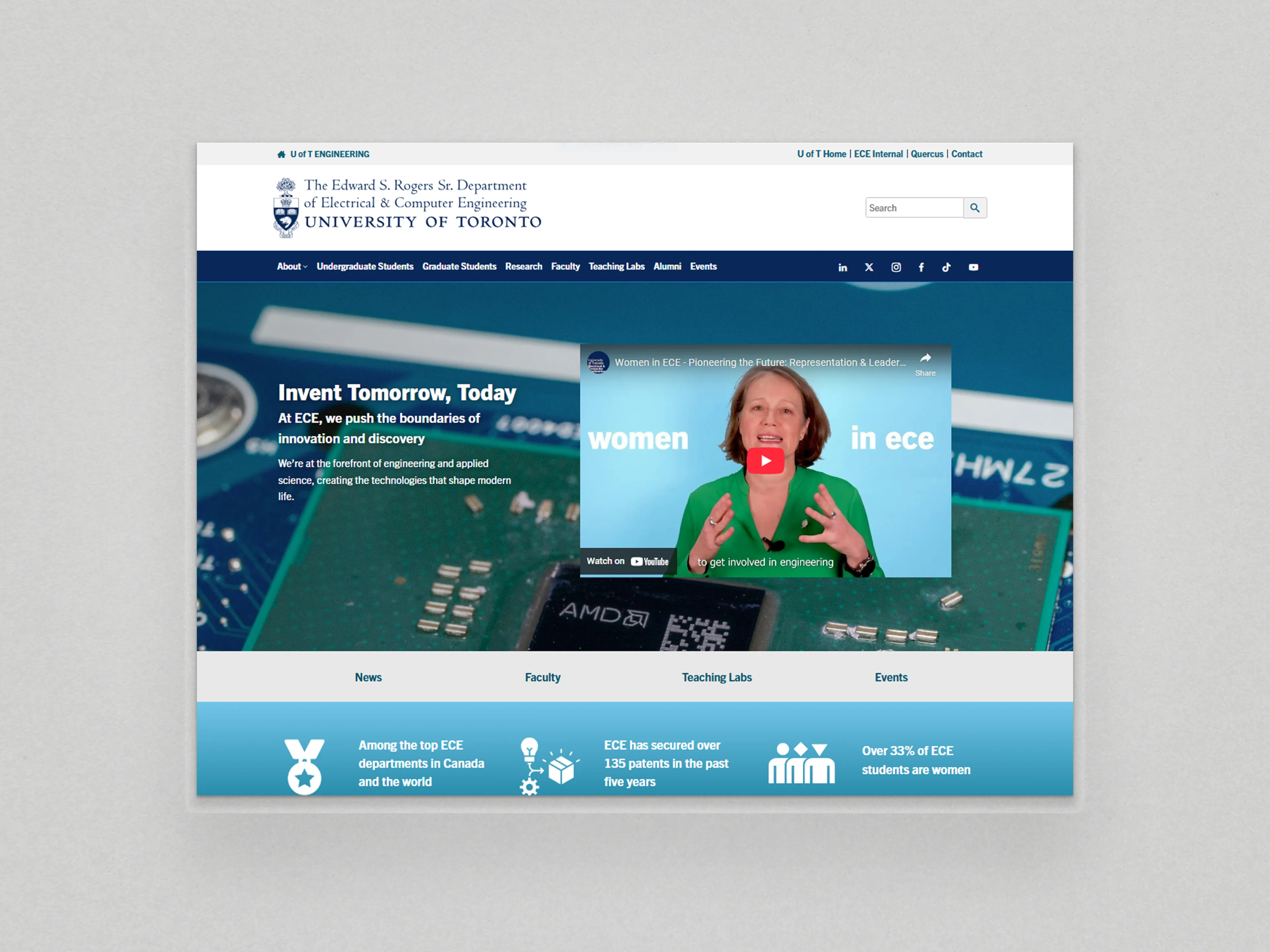
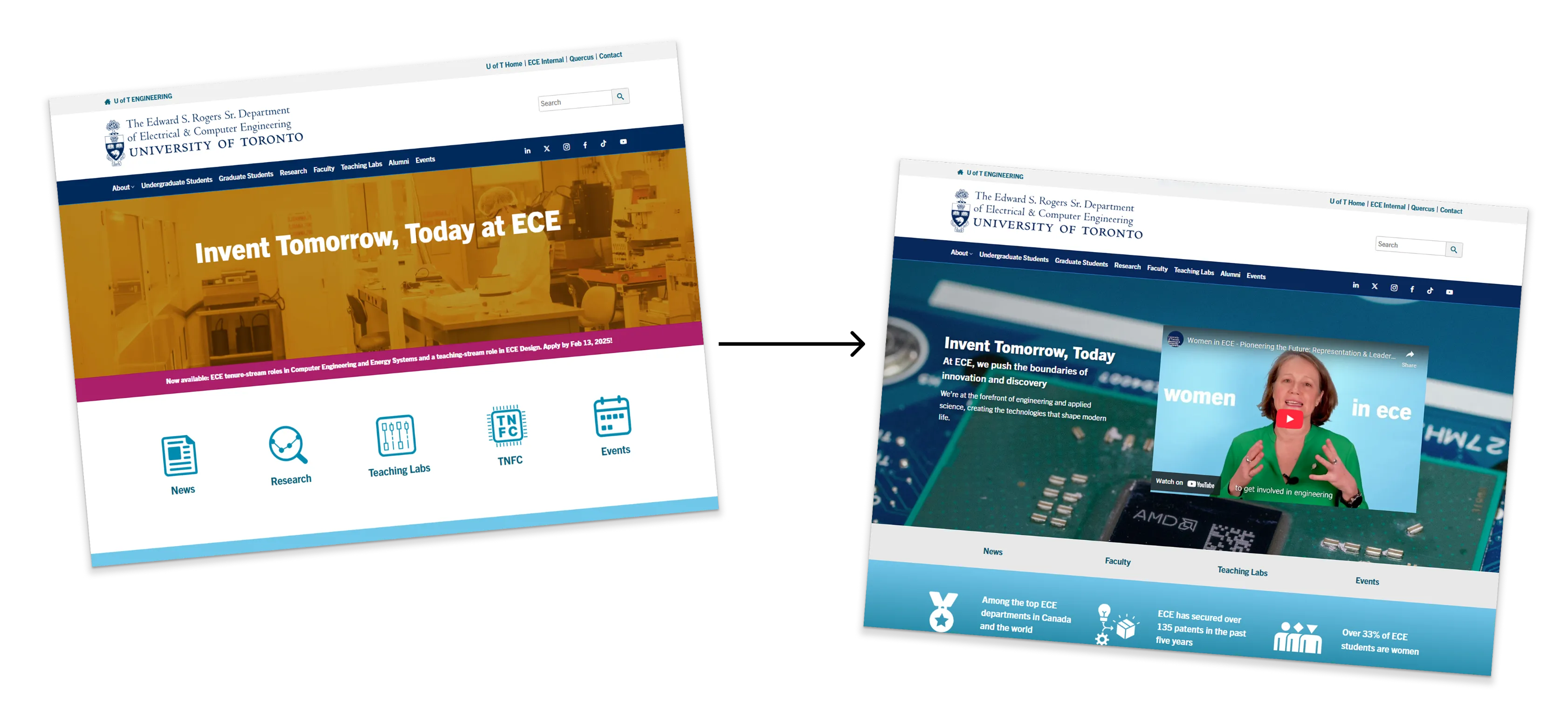
The goal of this project was to redesign the home page to serve as a tool for recruitment of prospective students and represent the ECE Department. 
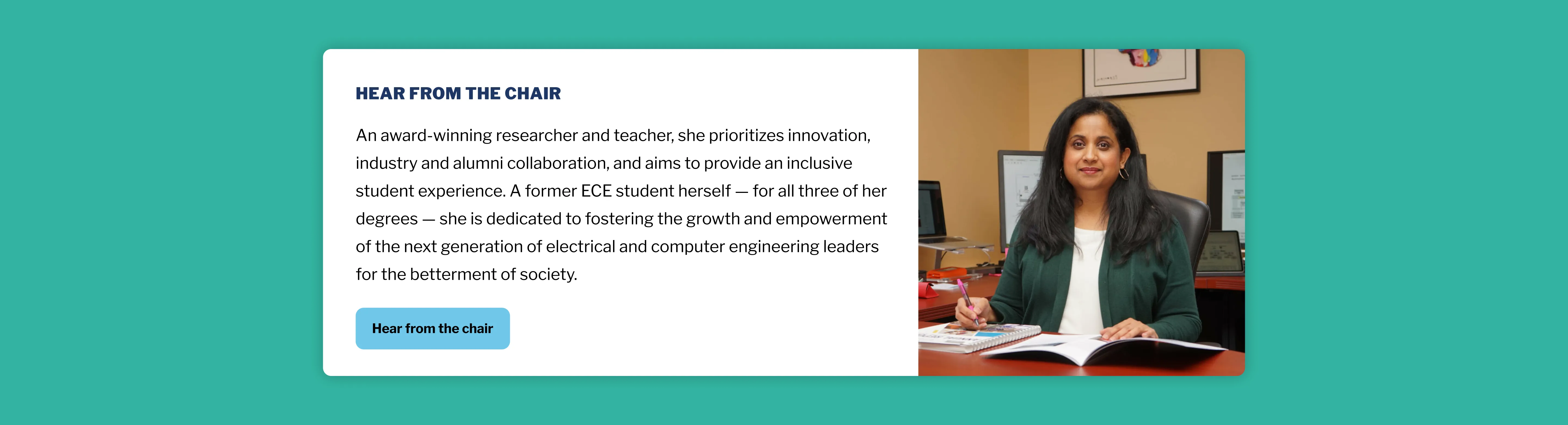
By structuring accurate content effectively and incorporating authentic images of the department, I designed the website's homepage on WordPress. 
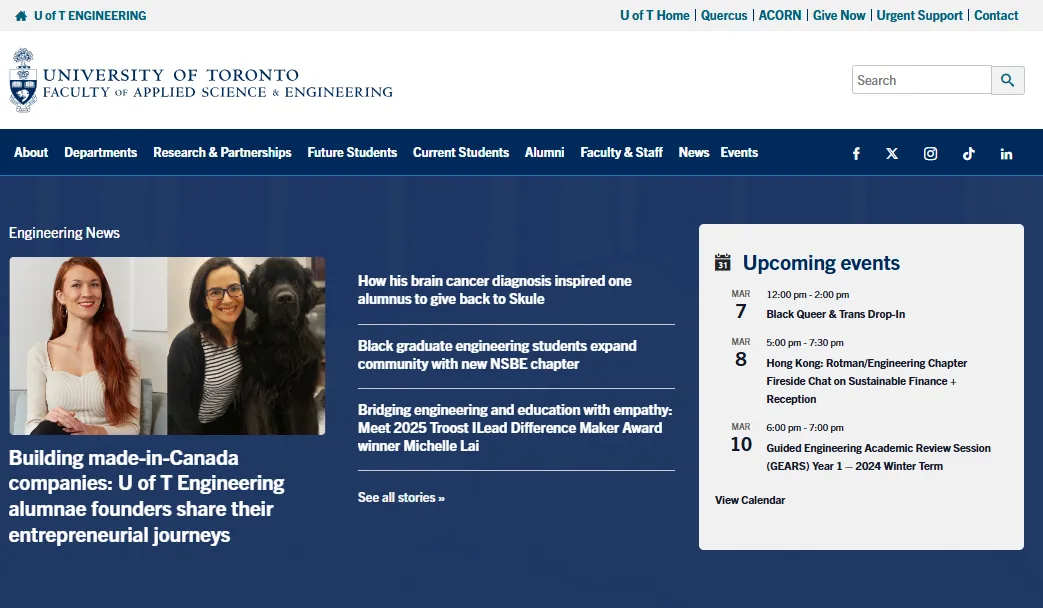
It was very important to ensure it served these requirements as it a part of the Faculty of Applied Science & Engineering at the University of Toronto. 
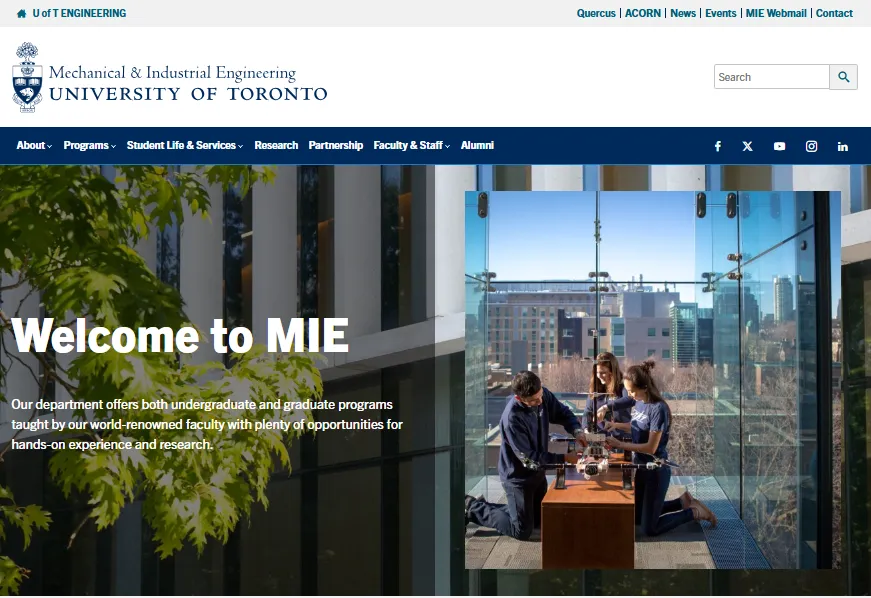
They need to attract as well as be consistent across the Faculty. There were strict guidelines and conventions to follow; this website would be used by students, professors, university staff, as well as Industry Partners throughout Toronto and Canada.

Key Takeaway: Stakeholder Perspectives

This project taught me to advocate for design and understand a wide range of stakeholders, including the different staff members in the department, the wider Engineering Faculty, as well as the needs and demands of the students we wished to recruit, and the Professors and Researchers who work at the Department.

Mockup of the redesigned ECE homepage